One of my favorite things about this time of year is thinking about what's trending for interiors in 2014. This list comes from things I've been noticing more frequently on the web and also from other influences such as fashion, colors, and believe it or not, even technology. All these elements have an impact on how we live and function in our spaces. So here are trends I'm currently seeing which I predict will continue in 2014.

This is a super fresh trend making a big splash. Painted cabinetry has been around forever - but the color of the paint has changed dramatically over time.

First it was white, then the trend of painting the cabinetry the same as the wall color in soft beige tones (which I still love!), then the super white (for the entire kitchen). Now, I am noticing the trend for rich pops of color for the cabinetry.


First it was white, then the trend of painting the cabinetry the same as the wall color in soft beige tones (which I still love!), then the super white (for the entire kitchen). Now, I am noticing the trend for rich pops of color for the cabinetry.
If you love this trend but are afraid to completely embrace it (since we know this can be an expensive trend), consider painting your kitchen island (or even a section of the cabinetry) a bright color for some pop.
Mixing Metals
I'm seeing everything from gold and silver leafed, antiqued brass, wrought iron, copper and bronze finishes all living happily together. The trick here - the more you mix it, the better it feels and works.

The easiest, least expensive way to experiment with this trend - select small accessories and picture frames. You can find these in vintage shops, salvage outlets and even flea markets for an antiqued feel. Also, it is perfectly acceptable for the finish not to be perfect - rust spots only add to the vintage feel here.

Midcentury Modern Influences
This trend really started with the introduction of Mad Men. At first, it was super hip and only for the bravest of homeowners. However, a couple of years later, lots of clients are jumping into this trend with lots of interiors seamlessly blending in the the vintage modern pieces with traditional elements for an amazing eclectic look.

For a fun taste of this trend, consider including a pair of iconic Eiffel Tower arm chairs as host and hostess chairs either in your formal dining room or breakfast room area (if you want to keep it in a casual space).

More Organic Artwork
I absolutely love this trend of using non-art as artwork. It makes interior design feel accessible to anyone brave enough to consider something outside the box.

Gone are the days of waiting years to save up enough money for a piece from the most prominent artist you can afford. Instead, people are taking items that give color and interest and arranging them for a visual feast.

When working with clients, I try to think about things that are meaningful - a hobby, their work, a treasured family piece. I'm constantly thinking, "What can we hang on their walls?" This is an easy one to incorporate into your own home, if you just sit and think about what you have that could be turned into artwork.

Navy as a Neutral
I have to confess, I was bummed when I learned Radiant Orchid was the color of the year for 2014. I really wanted it to be some form of navy since I am seeing it so often these days for interiors.
I have to confess, I was bummed when I learned Radiant Orchid was the color of the year for 2014. I really wanted it to be some form of navy since I am seeing it so often these days for interiors.

But, after some thought, I realized - navy is being used as a neutral in lots and lots of spaces. So, to pick it as the color of the year would be like selecting Kaki as the color of the year. With that in mind, I'm now thrilled it's not the color of the year. So, we will be using it for years and years to come as a fresh take on neutrals.

Quartz Stone
Another trend I'm thrilled to see - Quartz. If you are not familiar with this product, you have to go and see it in person. With a price point (as well as the look/feel) comparable to granite or marble, quartz is being used in lots of kitchen and bath renovations. The main reason? It's performance is far superior to the others. These days, clients seem to be more interested in making sure their interiors are practical and livable, rather than just pretty. With Quartz, you can have both!


Another trend I'm thrilled to see - Quartz. If you are not familiar with this product, you have to go and see it in person. With a price point (as well as the look/feel) comparable to granite or marble, quartz is being used in lots of kitchen and bath renovations. The main reason? It's performance is far superior to the others. These days, clients seem to be more interested in making sure their interiors are practical and livable, rather than just pretty. With Quartz, you can have both!
If you are a die hard granite fan, quartz may win you over. There are lots of manufacturers of quartz, but some of it's attributes are a lifetime warranty, it's stain resistant (unlike marble), many can be polished or honed, and the slabs are consistent making the "grade" of the slab issue non-existent.
If you are fan of marble, quartz can still work for you. There are lots of colors that look like marble. My favorite is by Ceasarstone, but Silestone has a couple of great colors as well. No more fretting over a spilled glass of white wine or that spot of soy sauce that you forgot to clean up last night.
Large Scale Floral Prints (in small doses)
As I mentioned two years ago, this trend is gaining steam. With the release of Alessandra Branca's chintz collection for Schumacher this past year along with the use of these prints in small doses with modern fretwork patterns, I'm seeing lots and lots of large scale florals. In fact, the current of House Beautiful has a feature on Miles Redd with an image of a Brooklyn Townhouse with accent pillows in Lee Jofa's Hollyhock print.
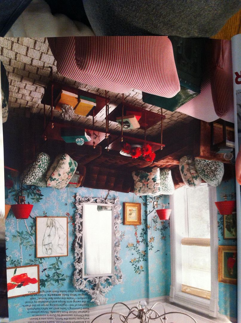
It's a showstopper. Just remember this is not your 1980's floral! It's small does mixed with current trends to create something completely fresh.

image taken with iPhone from January 2014 issue of House Beautiful
It's a showstopper. Just remember this is not your 1980's floral! It's small does mixed with current trends to create something completely fresh.
So, those are predictions for 2014. Let's see how they shake out! Happy weekend, everybody. M.
Tidak ada komentar:
Posting Komentar