
Happy Friday! What a whirlwind of a week. To kick off the weekend, it's time for the second installment of my Tween Bedroom Makeover. If you missed last week's post you can click over and check it out here.
With the design plans I create for clients, I always start by trying to determine what is working in the space and what needs to be tweaked. I ask lots of questions including how the space will be used once completed. It's important to get your client's vision for how they want to live in the room. Sometimes, they don't even know. So you have to get them to think about it. Questions like - What do enjoy doing (i.e, hobbies)? When you get home in the evenings, what's the first thing you do? etc. Once I gather all this information, I brainstorm on ways to make the space look great and work for their lifestyle. It takes both for a space to be great.
So, with my daughter's bedroom, I decided to approach this project in the same way.
The Delimma
Since living in the space for almost ten years, some of the biggest problems were obvious. First, the layout of the room is really difficult when determining furniture placement. While the room is large, there are lots of doors and oddly placed windows. We moved her bed so many times I lost count and still it did not feel quite right for the room. The biggest issue was the dinky window on the largest focal wall in the space. It's not centered so it's hard to create a focal point without the window getting in the way. We've tried the bed on the wall space to the left of the window and it felt like an afterthought. There isn't enough space to the right of the window because of the closest doors. Very frustrating space!

Secondly, the room did not reflect her personality. She loves to read, and there really wasn't a nook in her space to do this. She also likes to collect lots of memorabilia (I realize this is a common teenager trait), and she needed a place to display it rather than covering every table top in the room withjunk lovely collected items. Lastly, she often commented on the fact the room felt very cold and not welcoming (my word). The main reason for this was the rug in the room which was really too small for the space. I knew this was a problem, but we were making do with what we had in there!
Secondly, the room did not reflect her personality. She loves to read, and there really wasn't a nook in her space to do this. She also likes to collect lots of memorabilia (I realize this is a common teenager trait), and she needed a place to display it rather than covering every table top in the room with
The Wish List
Here were the items she requested for her room. She loves the color turquoise/aqua and wanted this to be a main color theme. She loves to read and wanted a cozy reading spot. She wanted a "fluffy" (her word) rug to be able to get down on the floor and hang out with friends. Things she loved and wanted to keep in her room were all her memorabilia, her bulletin board, her chalkboard (which she is constantly writing funny sayings, to do lists and thoughts for the day, etc.). There were also a few things I really felt like the room needed to function for a growing tween - more storage for folded clothes, a bedside table, a long dressing mirror (she was constantly in my closest in front of mine!), and for the design to get her through high school (or with smaller tweaks, get her through high school). I also decided we needed to keep the raw silk stria draperies (just too expensive to replace). So, I wanted to come up with a way to make them more fun and youthful.
With all this in mind, I took inventory of the pieces in her room worth keeping as well as the pieces that needed to be edited out and created a plan. As with a client project, I took measurements of the room, with window and door placement noted on the diagram. With all this information at hand, I developed a new design layout for the space. Once I began to treat her space like that of a client, the perfect layout jumped out at me! It was a layout we have never tried before in her room. Each time we would rearrange furniture, I was so focused on making sure it all fit back into the room that it was limiting my ability to see this new layout. Once I let go of the idea that we had to use all the pieces currently in the space, the layout was obvious. Also, I decided not to fight the window placement on the focal wall and incorporated it into the design. I layered one of the bedside chests in front of it and then used a large piece of artwork to balance the window over the opposite chest. This is a great trick for keeping the symmetrical feel. I do it all the time in client's spaces. Not sure why it was such a mystery here!

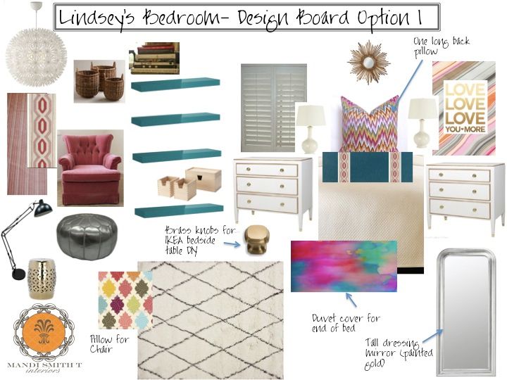
With the layout established, I went to work on sourcing the additional items we needed to pull the room together. Here is the original design board I came up with for the space. We've tweaked a few items due to budget, but followed the board for the most part. Just a few things to note on the design board. The pink chair was in her room before, but by pairing it with the morrocan pouf, floor lamp and side table it feels more modern. This was the reading nook she needed. Also, the chevron IKAT pillow on her bed has so many colors in it. It allowed us to reuse the pink stria drapery panels while still giving my daughter the pop of turquoise she was craving. We reinvented the draperies by removing the tassel fringe and adding a fun flat tape to them in a more modern pattern.
Next week I'll show you what I did to begin the installation of this project! Happy Weekend. M.
Tidak ada komentar:
Posting Komentar