Selasa, 30 Juni 2015
Lindsey Torpey Awarded Most Valuable Volunteer Award
Lindsey’s well-rounded involvement throughout not only the design world, but within University of North Texas earned her the tremendous title of Most Valuable Volunteer. She will be featured in the next publication of QUAD, as well as announced on the Campus Center Awards website.
Summer Pasta Salad
Since the 4th is fast approaching, I thought I would share one of my favorite summer recipes with you - Pasta Salad
I got this recipe from a friend of a friend, and I think we make it at least every other week in the summer months. It is wonderful hot, cold and even room temperature. I have served it with any grilled meat you can name, hamburgers and even as a side for sandwiches. It's that versatile.
I got this recipe from a friend of a friend, and I think we make it at least every other week in the summer months. It is wonderful hot, cold and even room temperature. I have served it with any grilled meat you can name, hamburgers and even as a side for sandwiches. It's that versatile.

Start by cutting up two pints of grape tomatoes (they are sweeter than the cherry tomatoes and when cut in half are the perfect bite size).

Always cut them on the perimeter rather than from stem to end. I just learned this from an amazing cook at our church. When you cut them this way, they burst in your mouth for ultimate flavor.

Add to these, several leaves of fresh basil julienned.

I like to stack the leaves on top of each other and fold them into a tight roll before cutting.

Makes quick work of it.

Then add four teaspoons of garlic, one teaspoon of salt and 1/2 cup of extra virgin olive oil.

Here's the most important step. Let this mixture sit at room temperature for at least four hours. This allows the garlic and basil to flavor the oil so that every bite has great taste.

Cook your pasta, any shape will work.
Drain your noodles and add immediately to the tomato mixture along with 1/2 cup of grated parmesan cheese.

Serve as is or chilled. If you want to make this a main course, simply add grilled chicken or shrimp.

It's the perfect side dish for your weekend grilling. I know we're having it for sure!
Happy Summer! M.
Happy Summer! M.
Senin, 29 Juni 2015
Project in Progress - Master Bathroom
One of the projects I have been working on is a total renovation of a home in Mountain Brook. For those not familiar with Birmingham, Mountain Brook is a city just outside of Birmingham. It is a beautiful residential area with lots of great homes and mature landscaping - just lovely.
My clients purchased a home in foreclosure and have been renovating the entire space. It has been such a fun project to be a part of and the new house is beginning to finally emerge. Although we are far from the finish line, I thought I would share a small sneak peek of a few rooms.
My clients purchased a home in foreclosure and have been renovating the entire space. It has been such a fun project to be a part of and the new house is beginning to finally emerge. Although we are far from the finish line, I thought I would share a small sneak peek of a few rooms.
Master Bathroom


In this shot you can see the other vanity area. Really pretty layout.

For the floors, we used large 18" square tiles and had them laid on the diagonal for a dramatic look. They still need to grout the floors, but aren't they pretty!
It's hard to see (since I am such a bad photographer), but the large tiles are polished and the small accent tiles are a tumbled finish. This contrast really adds a lot to the look.
Here's a tip: the floor tiles are porcelain (not marble)! But we selected one that has the same look. We saved quite a bit of money by doing this, which can then be invested in the free standing tub and the marble countertops on the vanity. You have to know where to save and where to splurge to make this work!
Here's a tip: the floor tiles are porcelain (not marble)! But we selected one that has the same look. We saved quite a bit of money by doing this, which can then be invested in the free standing tub and the marble countertops on the vanity. You have to know where to save and where to splurge to make this work!

A few pictures of other rooms.
Master Bedroom
You can easily see the wall where the bed will go. The home has lots of light.

Family Room
This rooms opens on to a back terrace. Very elegant.

Breakfast Room
This is the breakfast room which opens to the kitchen and out onto the terrace to the right. It has such a beautiful view of the back yard. The ceiling is a high cupola with beam work.

I will share the final results when we get there!! It will take a while, but will be totally worth it. M.
Minggu, 28 Juni 2015
Rock My Boat - Offices
Here are a few office pictures I've been collecting for a while now. I think they are all interesting in different ways.
I love how the books and accessories in this office really show up against all the white furniture. Then the contrast you get with the one black chair and pops of pink.

Source
Another example with white furniture but what draws me to this one is the wonderful wall color - sort of a smokey/blue gray. I also like the very vintage traditional desk and simple chair paired with the more modern open bookshelves with the chrome brackets - nice combo.

This one feels glamorous to me. I think it's the curvy table legs (yes those are two tables rather than a desk which is clever), the pops of pink and that beautiful landscape painting hung oh so low on the wall.


Wow, there are some many things to talk about in this example. First, the wall color is almost a blushy pink and notice the curved ceiling and the fantastic lantern. But it doesn't stop there, see the two additional pendant lanterns that are hanging near the wrapping station (notice they are not centered on that wall). I say wrapping station b/c of that large roll of what appears to be paper. The painted floors are fantastic (if you want to read more about painted floors, you need to jump over to my friend Shart Hart's blog Design Indulgence where she bravely painted all her hardwood floors white for an amazing freshen up). Sorry, I disgress. Lastly, notice the large circle of pink with floral accents on the wall above the wrapping station. So interesting.

This office space is much more masculine. I adore the beam work, the painted brick columns, and the wall of windows/french door. It's all working for me. Although I love the look of all the photographs, I'm not sure I could work in this space everyday. It might be sensory overload for me.

Here is a close up of a well appointed desk top. All the things you need for work do not have to be mundane or utilitarian - like rubber bands, paper clips etc. You can make them look pretty. For me, when I'm organized, I'm more productive.

The wall art, the lamps, the colors in this space. My mouth is watering.

Usually, too much wood in a space makes me crazy. I think you can totally over do it with casement pieces. But in this case, the white walls and painted ceiling give your eye some relief from all the wood and contrast it nicely. I also like the groupings of artwork and open white shelving.

This photograph is the first one I saved on offices. It is ringing all the bells and blowing all the whistles for me!
Soak it in.

I love the idea of a lounge spot in the office. Also, the fact that the walls and the desk area are painted a single yummy color, makes the space look larger.

This office space feels like a little get-a-way to me. Almost as though working is a bit of an escape.

Another pink office! I see a theme here and I really didn't think I was a fan of pink. I guess I am secretly yearning for my very own office space.

This office is a nice balance between feminine/masculine, traditional/contemporary, light/dark colors. I also love those low alcoves in the shelving unit. Wonderful.

Just a little visual escape today! Enjoy the rest of you day. M.
I love how the books and accessories in this office really show up against all the white furniture. Then the contrast you get with the one black chair and pops of pink.

Source
Another example with white furniture but what draws me to this one is the wonderful wall color - sort of a smokey/blue gray. I also like the very vintage traditional desk and simple chair paired with the more modern open bookshelves with the chrome brackets - nice combo.

This one feels glamorous to me. I think it's the curvy table legs (yes those are two tables rather than a desk which is clever), the pops of pink and that beautiful landscape painting hung oh so low on the wall.

OK, I realize this one is really more of a work space rather than a single office, but I love it. I think a space like this can actually make you more creative! Is it just me? I think a great office/work space encourages you to get your work done! Draws you into the space somehow and makes you want to get busy.

Source
Wow, there are some many things to talk about in this example. First, the wall color is almost a blushy pink and notice the curved ceiling and the fantastic lantern. But it doesn't stop there, see the two additional pendant lanterns that are hanging near the wrapping station (notice they are not centered on that wall). I say wrapping station b/c of that large roll of what appears to be paper. The painted floors are fantastic (if you want to read more about painted floors, you need to jump over to my friend Shart Hart's blog Design Indulgence where she bravely painted all her hardwood floors white for an amazing freshen up). Sorry, I disgress. Lastly, notice the large circle of pink with floral accents on the wall above the wrapping station. So interesting.

This office space is much more masculine. I adore the beam work, the painted brick columns, and the wall of windows/french door. It's all working for me. Although I love the look of all the photographs, I'm not sure I could work in this space everyday. It might be sensory overload for me.

Here is a close up of a well appointed desk top. All the things you need for work do not have to be mundane or utilitarian - like rubber bands, paper clips etc. You can make them look pretty. For me, when I'm organized, I'm more productive.

The wall art, the lamps, the colors in this space. My mouth is watering.

Usually, too much wood in a space makes me crazy. I think you can totally over do it with casement pieces. But in this case, the white walls and painted ceiling give your eye some relief from all the wood and contrast it nicely. I also like the groupings of artwork and open white shelving.

This photograph is the first one I saved on offices. It is ringing all the bells and blowing all the whistles for me!
Soak it in.

I love the idea of a lounge spot in the office. Also, the fact that the walls and the desk area are painted a single yummy color, makes the space look larger.

This office space feels like a little get-a-way to me. Almost as though working is a bit of an escape.

Another pink office! I see a theme here and I really didn't think I was a fan of pink. I guess I am secretly yearning for my very own office space.

This office is a nice balance between feminine/masculine, traditional/contemporary, light/dark colors. I also love those low alcoves in the shelving unit. Wonderful.

Just a little visual escape today! Enjoy the rest of you day. M.
PS: I have been saving these photographs for awhile so I'm not certain I have all my sources correctly linked. If you see one that does not have proper credit, please email me! They are all fantastic, and I want to ensure the proper person gets credit for these spaces! Thanks. M.
Sabtu, 27 Juni 2015
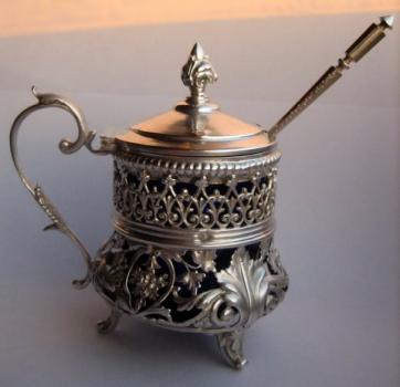
Antique Lesson - Mustard Pot
I always assumed that mustard got it's name from the mustard plant which bears the seeds used in mustard. But apparently, it's the other way around!

The mustard plant acquired its name from the French (moutarde) which in turn came from the Latin word for infermented wine: mustum. Wine was mixed with the powdered seed of a plant (now known as the mustard plant) and used to season foods. Initially, it was served in it's powdered form table side (sort of like salt). The change from dry to wet mustard took place some time in the 18th century. So, mustard got it's name from infermented wine! Source - The What is? Silver Dictionary.
One of the main reasons I continue to post on unusual silver pieces is because I am fascinated by how much time and energy were devoted to ensuring commonly used products (like mustard) were served in a beautiful way. We are talking mustard here, people!

Once mustard pots became popular, silversmiths began to create a variety of shapes and styles. It was very common for the body of the pot to be pierced to allow the beautiful blue glass (included to prevent corrosion) to show through as ornamentation.

I think a mustard pot would be a wonderful addition to a beautiful table setting. You just have to think about something you could serve that requires mustard?
No, I was not thinking hot dogs . . . Maybe something a bit more creative.

How about Beef Tenderloin with Mustard Roasted Potatoes (from Smitten Kitchen) and extra mustard for serving in your silver mustard pot, of course!!

Wow! I think I'm hungry now.
A post about silver making me hungry. Who knew!

Have a great Monday. M.
Thinking About a Little DIY
Noticing a lot of chatter lately about the hot summer trend of all things nautical - which is so fun for summer. Here is one great piece I've had my eye on . . .

I think it is so chic and would add just the right amount of sparkle to my coffee table. But, I can't justify $185.00 for a trendy accessory. I know, it's really great. Isn't it?

So, I was thinking (my husband says he dreads that phase more than anything in the world) . . . What if I took this shell (at $24.95).

or this one at $25.00 (it's resin).

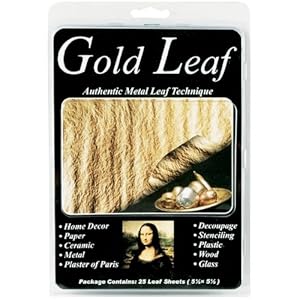
And painted the interior gold (since brass/gold accents are still hotter than hot). There are so many options for how to add the gold accent. You could do gold leaf which would add a lot of texture to the inside.
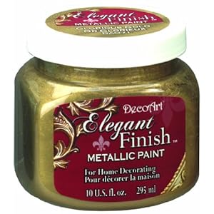
or craft paint - this one feels aged to me which is a great thing . . .
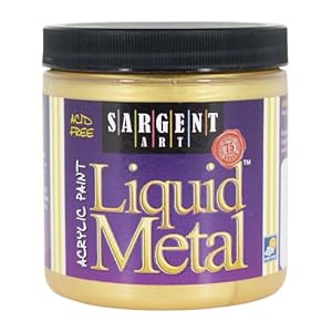
or even a little metal (anything called liquid metal, I'm in!) . . .
You've got yourself a nautical/gold chachkie for a fraction of the price! With a deal like that, I really wouldn't feel bad moving on when the trend is over. M.
Kamis, 25 Juni 2015
Trend Spotting - Bag O' Beans
OK, now for something fun! I asked the talented Sophie Tardiff if she would put together some thoughts on a trend she is seeing in the interior design world. Sophie is a writer and marketing guru, and she really has her finger on the pulse of cutting edge trends. Sophie take it away . . .
Hello Musers. I am thrilled to be with you today talking about trend spotting. When Mandi ask me what trends I was seeing in the interior design world, the first thought that came to mind was bean bag chairs. While we all know they are amazingly comfortable, the bean bag chair is making a huge come back.

They’re soft and conform uniquely to your posture in any way you want to sit or lie on them. They’re like no other piece of furniture.


Comfort aside though, it can be easy to think of them as only for the playroom or child's bedroom. What isn’t obvious is how chic they can be in the right setting. They also come in so many different forms making them really versatile. Traditionally, bean bag chairs only came in spherical shapes which could be quite limiting. Nowadays, this is no longer the case.

Square bean bag chairs can be morphed into body pillows, armchairs, or stools. Bean bag ottomans can be sprawled out to create sofas for several people to lounge on. Teardrop bean bags give more back support to emulate an armchair style.

Different styles of bean bag chairs allow you to emulate existing furniture, which can eliminate an awkward juxtaposition if you intend to put them into a room with actual sofas and armchairs. Again, this is important for obtaining a chic result.

The other thing to consider is colour and fabric choices. Stark black and white rooms work well with bean bag chairs in a solid bright color to create major impact in a space. Flat fabric textures work with subdued leather couches, while bold glossy faux leathers can work in a retro 60’s style décor. Warm colours and rough spun fabrics give off a bohemian vibe.

You simply have to think outside the box and consider making an old favorite part of your current decor.
Thanks Sophie for sharing your insight on a current trend! Now let's get out there and take charge of our Monday! M.