Sabtu, 31 Oktober 2015

Halloween - All Pinterested Out

I was chatting with a friend recently, and she was describing the decorations for a party she recently attended.  Her first comment was, "Well, it was totally Pinterested out!" For those of you familiar with Pinterest, you know exactly what this verb means.  

So, I have to ask . . .  is your Halloween party going to be all Pinterested out?  Here are a few of my favorites to get the job done. . . 


All images are from the very much beloved Pinterest.

Enjoy your day and evening! M.


Get the Look- Living Room

Let's kick off the week with a second installment of "Get the Look."  Today we are going to focus on this fabulous living room.  I just love the idea of using four chairs in a space like this.  In fact, I posted about this very idea for a living room.

Here's our inspiration. . . 

I know!  It's stunning.  So fresh and crisp - but not tied to a specific season.  I could totally see this space in the Spring/Summer months or in the Fall/Winter months.  Really nice combination.  Also, it's modern but with a cottage vibe - very difficult to pull off.  This is the work of Atlanta based interior design firm - The Design Atelier.  This one was a major challenge.  In fact, while I was sourcing it, I thought several times, "Now, why did I decide to do this series?!"  I hope you enjoy my efforts!  

Here are my finds for this lovely room. 


(1.) (2.) (3.) (4.) (5.) (6.) (7.) (8.) (9.) (10.) (11.) (12.) (13.) (14.) (15.) (16.) (17.)

Happy Halloween! M.

All Hallow's Eve

Here's wishing you a wondering holiday!  We are celebrating in our neighborhood with a very fun block party, and I'm looking forward to relaxing and seeing all the cute kiddos and their costumes.

To make the party fun, our neighbors all bring appetizers down to the street for the block party.  I'm constantly trying to come up with something yummy but a bit unusual.  I'm trying to decide what to whip up for the party.  True confessions here - my appetite is directly tied to how a food looks.  So, if the food is too creepy and gross my appetite goes straight out the window.  Things like brains, guts, eye balls and road kill - no, no, no and no.  I know this is not the case for everybody, but for me there is a fine line.  I want it to be fun, but not gross.  

So, here are some fun ideas that still seem yummy to me.


But what every floats your boat!  Enjoy your evening - be safe. M.


Jumat, 30 Oktober 2015

Interior Design Student Alliance (IDSA) Selected as Student Organization of the Month

Congratulations, UNT Interior Design Student Alliance (IDSA) has been chosen as the Student Organization of September, 2013! As Student Organization of the Month the IDSA will receive a monetary co-sponsorship from Student Activities.

IDSA combines 3 professional organizations into 1 student organization to help bridge the gap between students and professionals. Being a part of IDSA will provide interior design students with a way to acquire and develop personal and professional relationships that benefit its members during their education. The relationships made will be invaluable for students' professional career. For more information please visit UNT OrgSync page.

Trend Spotting - Rorschach Ink Blots

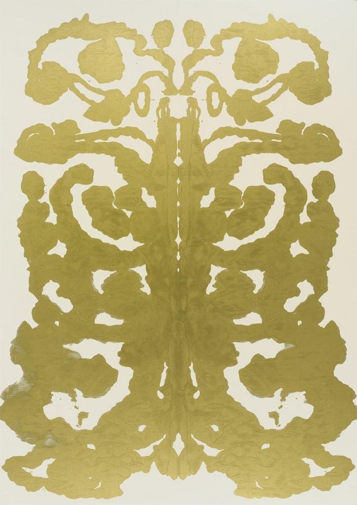
I recently saw this metallic version of an ink blot, and I can't seem to get it out of my mind.  It was created by Andy Warhol in the 1980's known as his Rorschach paintings, and it still feels super current and fresh today.  Wonder what came to mind when Mr. Warhol looked at his own inkblots?
Andy Warhol, Rorschach 1984

In case you're wondering, the Rorschach test is a psychological test in which subjects' perceptions of inkblots are recorded and then analyzed using psychological interpretations.  Some psychologists use this test to examine a person's personality characteristics and emotional functioning.  So, if I get a psychologist for a client, you know I'm going straight to these for some unique artwork for their home.

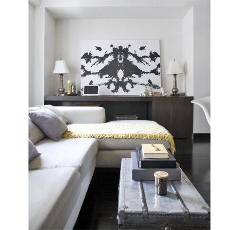
During his later years, Andy Warhol produced some stunning examples of these.  I love this one with black ink on canvas - it would look amazing with a metallic background.
via

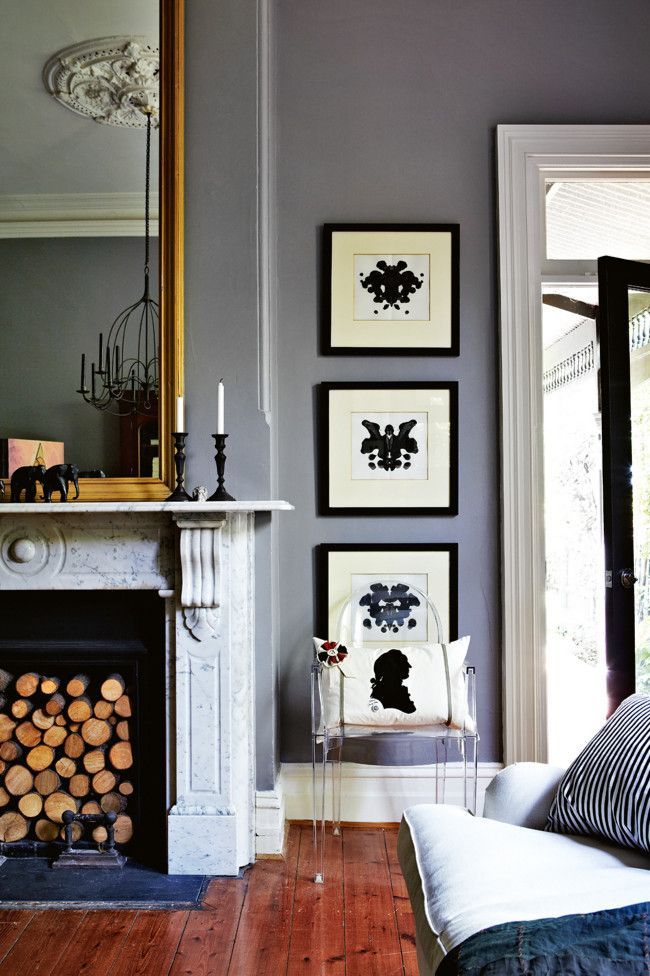
These have inspired lots of homeowners.  I just love how they look - notice the ghost chair layered in front of the lowest piece and paired with another favorite for me - the silhouette.  clever.

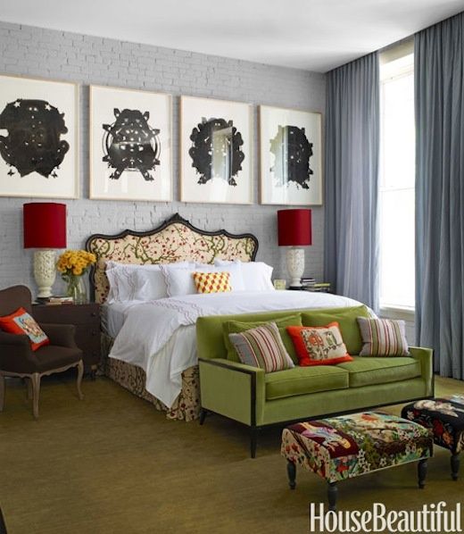
The traditional black ink versions have really been popular as artwork since this image was featured in House Beautiful.   Completely stunning!  Every room (even one with lots of color) needs a touch of black.


So, I think you know where I'm going with this . . . Even the most artistically challenged should be able to pull off some version of this, right?!  Could be a fun DIY to try with my daughter on a raining Sunday afternoon.  I'll have to pull together some supplies in case we have a moment to try this! M.

Kamis, 29 Oktober 2015

A Visit to Frank's House

We had such a fun trip to Chicago this weekend.  The weather was cool and clear - very crisp and perfect for a cozy sweater.  Most of our time was spent visiting with my husband's college friends and meeting their lovely wives.  We even got to see Northwestern beat Iowa for their homecoming game.  Very fun including the tailgating before and after!

If you recall, I left you with a small tease on Friday.  I mentioned we had one interior design related event on the agenda for the weekend.  I'm sure many of you guessed what it was, given we were in Chicago.  That's right!

We had the privilege of touring the home and studio of Frank Lloyd Wright. 
Here is a picture of the front of his home.   

And the side entrance which is where his studio was located.  This allowed Mr. Wright to basically work from home!  

When you mention Frank Lloyd Wright, most people think of the Robie House which is the quintessential example of his prairie style design.  It's one of the most visited sites in Chicago (so I'm told).

Since we only had time to tour one of the two, we decided to save the Robie house for another trip and check out where it all began.  Mr. Wright's home and studio.
   
At the age of 20 Wright got married, bought this property, designed and built this home, and lived here with his lovely wife and their children.  The reason I wanted to see this home instead of the Robie house was because it was his very first attempt at design.  He studied engineering, not architecture.  So, he taught himself how to design homes.  
As you can see, he had not yet figured out the Prairie style for which he would become famous later in life.  Yes, you can see elements which definitely evolved into the pairie style (like the block of six rectangular windows in the front and the deep eaves), but this home also includes lots of other elements influenced by the era and what he loved.  His home was a place to create and experiment with design elements.  He was constantly moving walls, adding details, etc. All these things helped him grow as an architect and learn what worked and what didn't. 

We had the cutest most entergetic tour guide.  And the tour was very informative.  I won't go into all the details (you'll have to take the tour when you're in Chicago, ask for Ann!), but I will show you a few things that caught my eye. 

When you enter the front door, this is what you see . . . 

The room is very modest in size, and sparse (like most of his interiors), but along the ceiling he included this "artwork" in the form of a plaster relief.  I have to say, it looked a bit out of place paired with the light oak paneled room. 

This is a shot of the master bathroom.  Indoor plumbing was a true luxury during his time, so this was very progressive for the day.  What I loved most about this room is how he dealt with the fact there were no windows in the room.  So, no natural light.  He managed to "steal" a bit of light from the master bedroom next door by creating a window into that room.  I was not allowed to enter the bathroom to take a close up picture, but you can see the sunlight beaming in from the room next door. 

The dining  room was a very interesting space.  It included original furnishings all of which were designed by Wright himself.

Although electricity was not yet being included in homes for lighting, Frank knew it was coming.  So, when he built this room, he designed a stunning light feature over the table and had it hard wired in preparation.  Year's later when electricity became available, it was lit for the first time.  Here's a close up.  Can you imagine being invited to a dinner party with this above the table (when no one else had lights)!?

OK, one last room to mention.  This is the children's playroom.  It has the same beautiful delicately designed light feature (except this one is a sky light) as well as the trim molding he was so famous for in later designs.  The loft area was a series of balconies he designed to allow his children to perform plays and other performances (btw, that is a statue of a headless angel on the right hand side which is hard to make out in this image). But what I want you to notice in this picture is the piano to the left.  

That is not an upright piano!  It is a baby grand, and Wright cut a hole in the wall and pushed it back to allow for optimal play space for his children.  Where is the back of the piano? It's hanging out in the stairwell with a "watch your head" sign on it for visitors!    

  In some strange way, I loved seeing this.  It demonstrates for me you have to think outside the box at times to see if anything great will come of it.  Sometimes it does and ehhhh, sometimes it doesn't.  But at least you are thinking creatively about options and ideas to make your space better. 

Without getting to philosophical, I want to leave you with a few other images.  These are the houses of some of his neighbors who hired Wright when he was just beginning his work.  You can see how they, too, evolved over time.  It also gives you a flavor for this beautiful neighborhood.


It's hard to appreciate the scale of these planters.  They are huge at around five and half feet in diameter.

All these homes are intermingled with large victorian style homes with ornate wrap around porches.  It was so interesting to see this mix in styles on one street.

Loved this pagoda design.  It was the smallest of all the homes on the street.

And last, this is the very first prairie style home Wright designed.  It's in the same block as his home and is currently a private residence.  How cool would it be to live in his first prairie style home?!

For those of you who have studied Frank Lloyd Wright in depth, please forgive any mistakes or broad brush comments I've made here.  I know enough to know I know very little!  But, my day at his home was extremely interesting and fun, and I'm confident it will not be the last time I open the book on him.   I hope you will have an opportunity at some point to check out his home in person.  If you would like more information go here.  It's one of the best spots in Chicago! M.

PS: One last thing to mention, my cell met it's end when it slipped from my back pocket into the potty at Frank's house!  So, if you need to get in touch with me, email is best for the next few days.  M.


Full Time Design Assistant Position

Laura Lee Clark Interior Design, Inc. is looking for a full time, Design Assistant, entry level position immediately. 1+ years experience is a plus.

Interior Design degree required; CAD, Excel expertise required. Assists project managers and lead designers with CAD, furniture/fabric schemes, budgets, pricing, etc.

Submit resume and portfolio in person or via email to: kari@lauraleeclark.com

Kari LaRusch, Senior Interior Designer
T:  214.265.7272
E:  kari@lauraleeclark.com
W: www.lauraleeclark.com

Universal Design Lecture by Cynthia Leibrock

Join the Interior Design Program Tuesday, November 5th in Room 223 of the Art Building for an informative and inspirational Universal Design lecture by Cynthia Leibrock, a renown specialist in Universal Design.

Antique Lesson - French Biot Jar


These lovely jars were produced in the first half of the 18th Century in the Biot region of southern France.

Their purpose is quite obvious - they were used to store both dry and wet goods.  

At the time these were very utilitarian.  But, now they are truly like antique works of art and can add some real interest to a space.   

As you might expect, lots of other cultures created similar vessels for everyday use.  So, whether you are considering the French version or one from Italy or even Greece, they are a lovely addition to any interior!