Here is the second installment of my Huntsville project. If you recall, I did an e-design for a client who lives in Huntsville, AL. Then, I actually got to travel there to style the new space and to do a redesign to the rest of the rooms on the main floor. For all the details on the e-design, here is my first post to get you up to speed. For today, I want to focus on the redesign aspects of this project. Often times, clients will ask me to design a room in their home. Once the new design has been implemented, they are left feeling less than thrilled with some of their other rooms. Listen, it happens. It's like getting a new pair of shoes - you love them but it makes your old shoes seem, well, sad. While I can't help you with the shoes, I have a solution for your rooms. It's called a redesign and you would be amazed what spending a bit of time fluffing can do for these rooms.
Our goal here was to subtly inject the the same modern pops we implemented into the newly designed family room to help blend the old with the new. Sometimes it difficult to know where to begin when trying to add some modern touches to a traditional space. Here are a few of my tricks to make this happen.
The Living Room
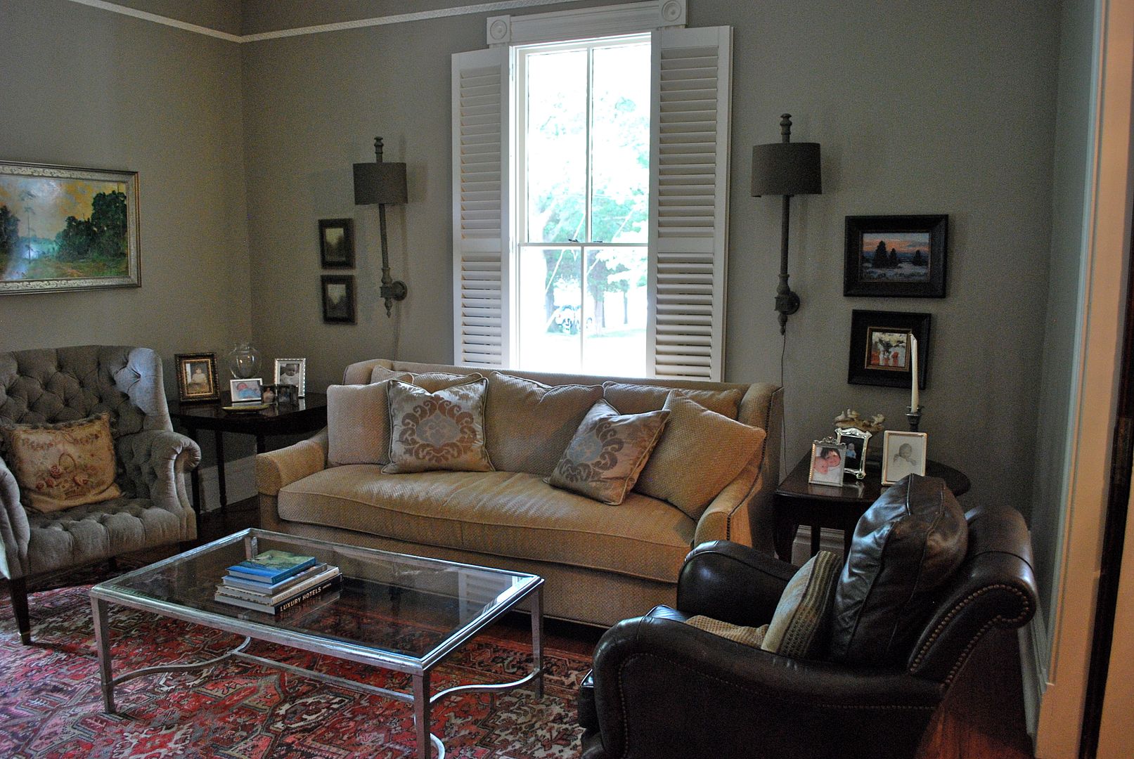
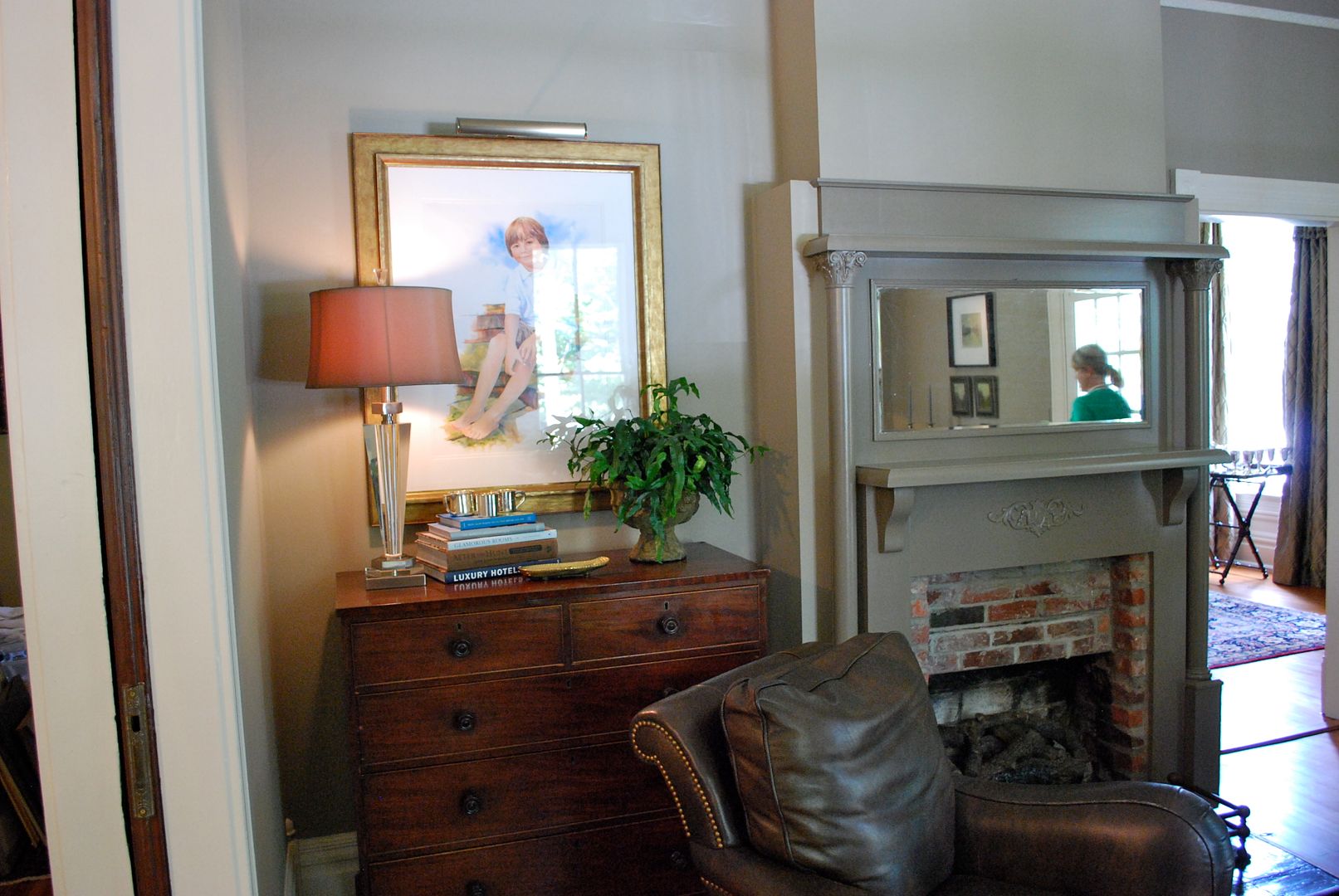
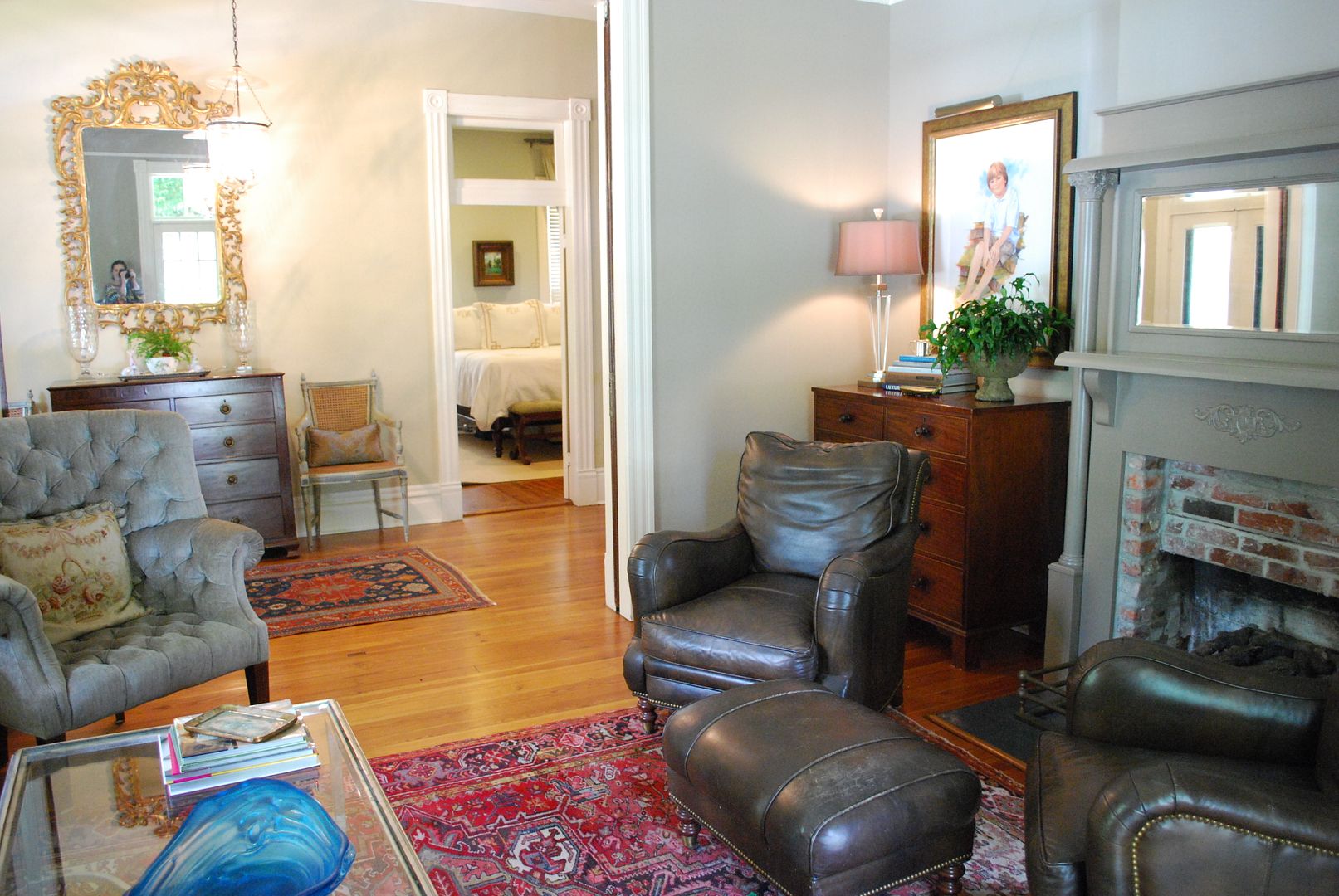
The living room before . . .
I had already moved a chair before I snapped this picture (I just get too excited and forget to take pictures) - but there was another leather chair beside the one you see on the right. They were floating in the opening to the foyer.

Our goal here was to subtly inject the the same modern pops we implemented into the newly designed family room to help blend the old with the new. Sometimes it difficult to know where to begin when trying to add some modern touches to a traditional space. Here are a few of my tricks to make this happen.
The Living Room
The living room before . . .
I had already moved a chair before I snapped this picture (I just get too excited and forget to take pictures) - but there was another leather chair beside the one you see on the right. They were floating in the opening to the foyer.
And Another Before . . . As you can see, there are some beautiful furnishings in this home, and there is not a thing wrong with this furniture layout. Our clients just really wanted the spaces to feel as fresh and new as the family room at the end of the day. So, that takes a bit of change!
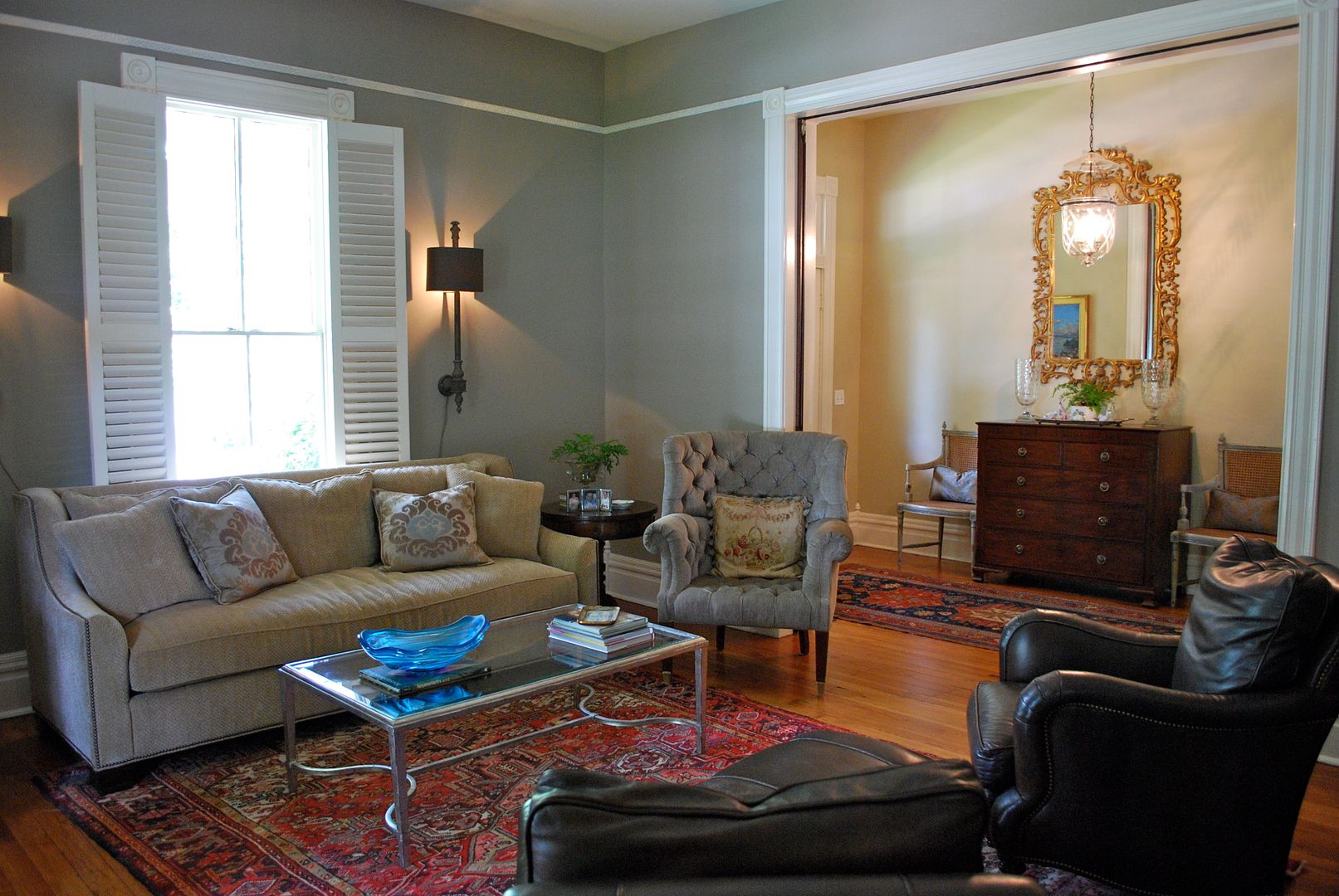
OK, now for a few afters . . . As you can see in this first picture, we did some editing to give the room a cleaner (aka more modern) feel. We also made one subtle, yet very important changes to the space. We rotated the rug to run with the length of the room - this gave the room the illusion of more space and allowed you to see the fabulous hardwood floors.
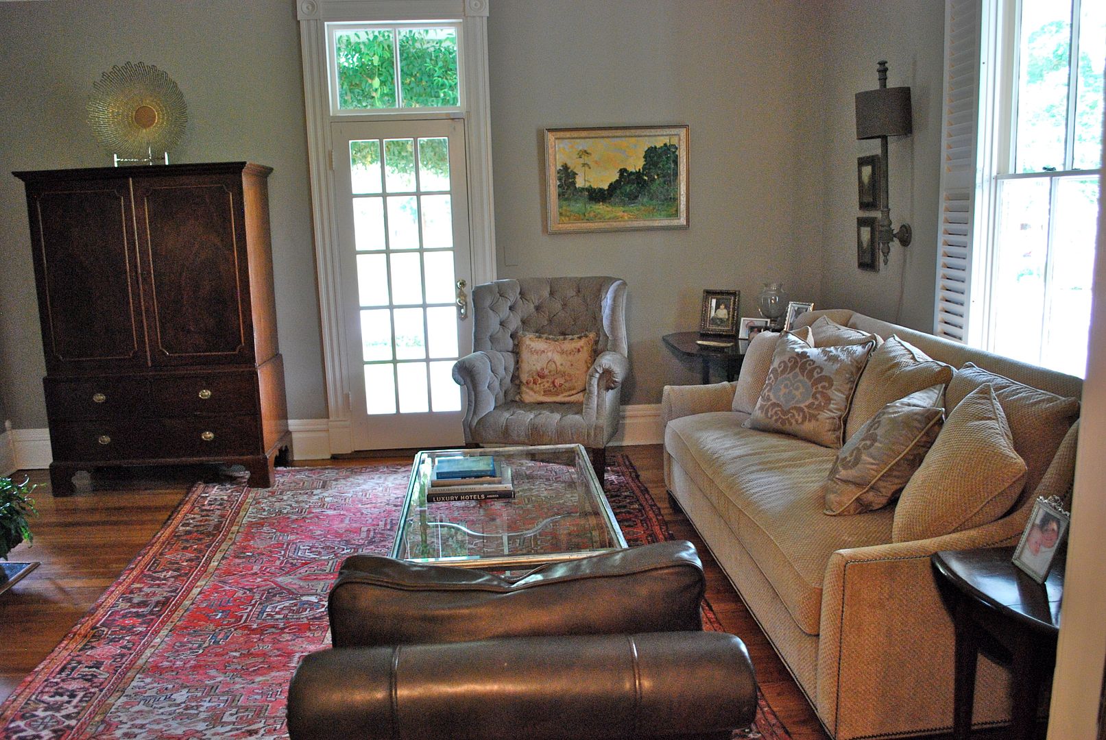
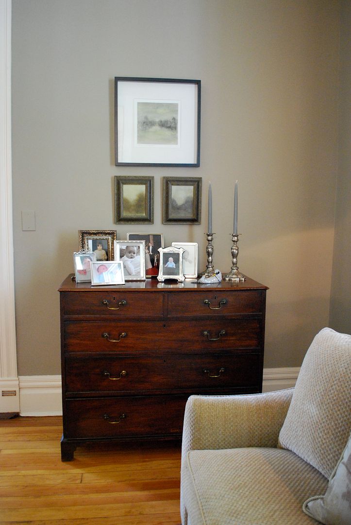
We also pulled in a chest from the bedroom and created a grouping of artwork with a more modern feel. The top piece was in the powder room and the two smaller pieces were on the wall to the left of the sofa in the before pics. We chose not to include an end table on this side of the sofa.
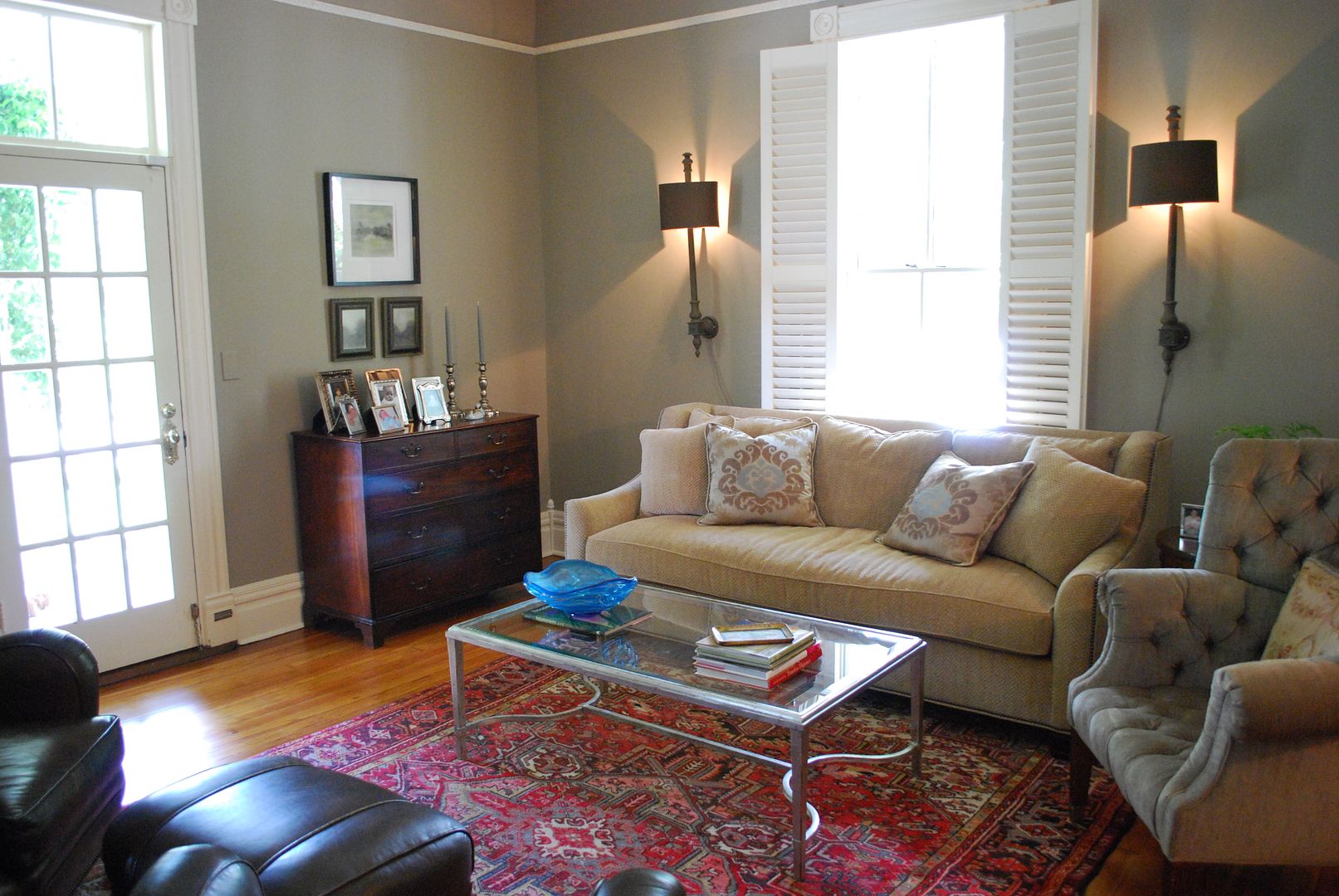
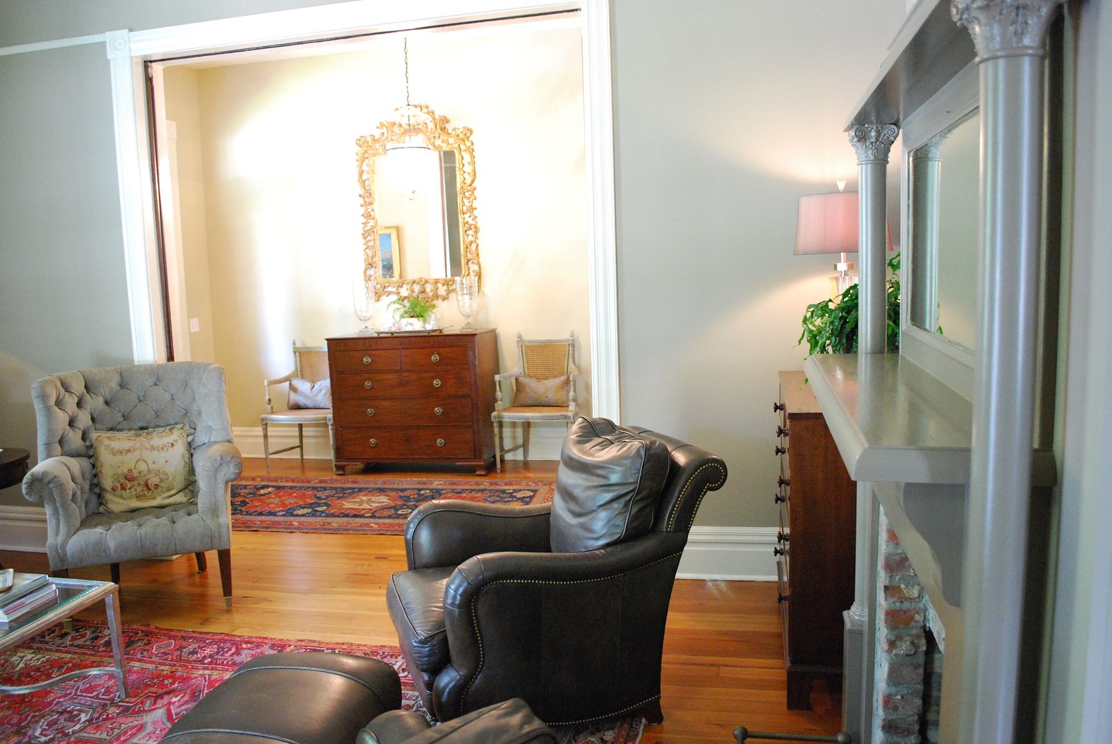
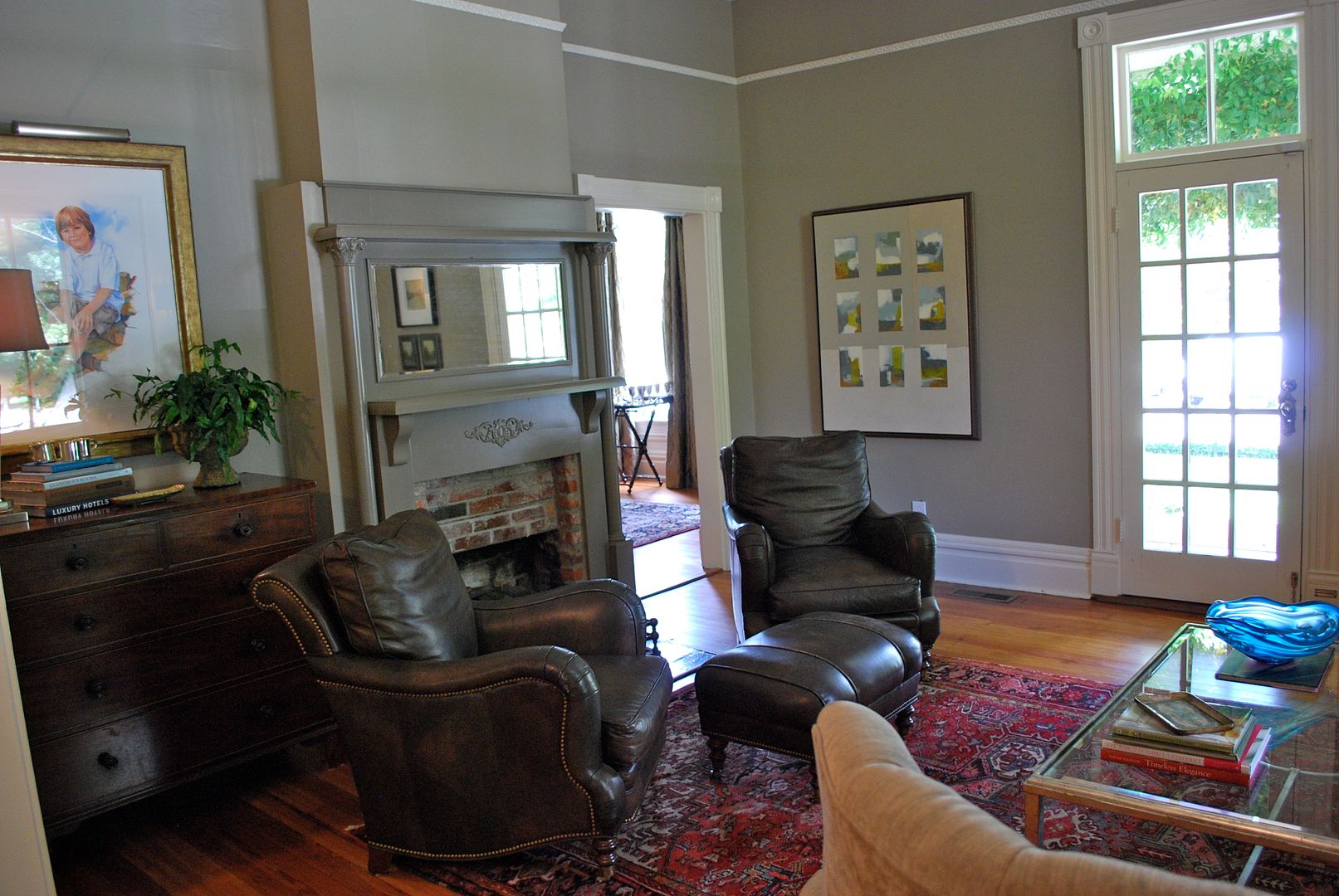
Now for the fireplace wall. The chest to the left of the fireplace remained and we simply restyled to the top. But by moving the leather chairs to flank the fireplace, you now see the nail heads and more modern lines of the arms of these fabulous chairs. Again, they are reading more modern at this angle.
We restyled the coffee table with a glass sculpted bowl (one of the homeowner's favorite modern accessories) for a pop of blue and notice we removed all artwork from behind the sofa. Leaving just the wall sconces for some much needed light in this space.
I have sourced some lumbar pillows for these leather chairs in a light fretwork pattern (another great opportunity for interjecting some modern style), but other than that, we used things the homeowner had on hand.
Lastly, we moved the oversized armoire (we needed it in the bedroom to house the TV and AV equipment) and replaced it with a large modern abstract painting. This makes the room feel larger and more open. Again, less traditional.
So, one more shot of this room and how it relates to the foyer and master bedroom beyond. I did not realize I took my picture in the mirror! Too busy at this point to photoshop me out of the image!
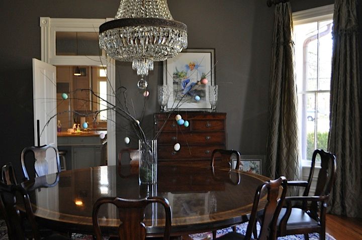
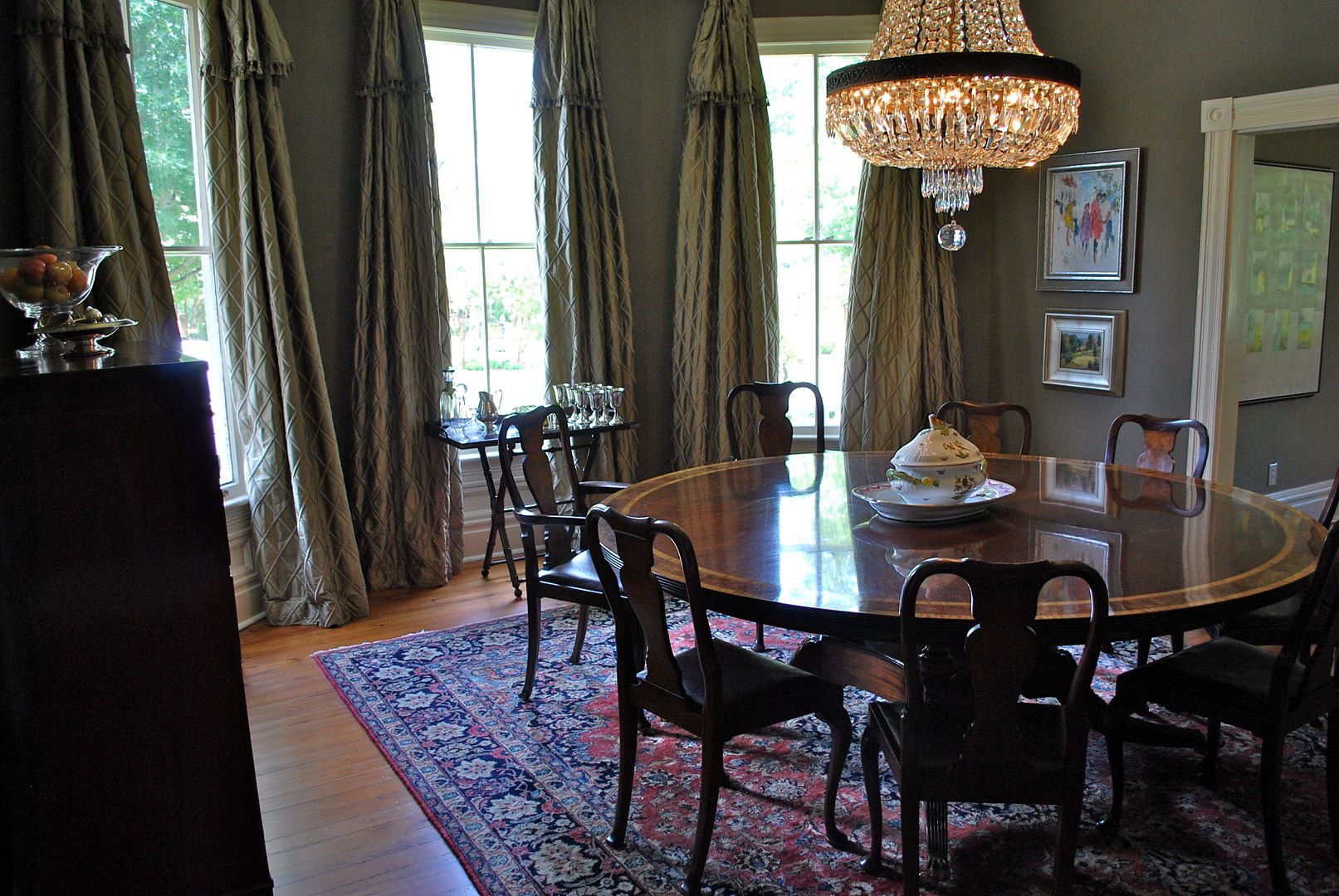
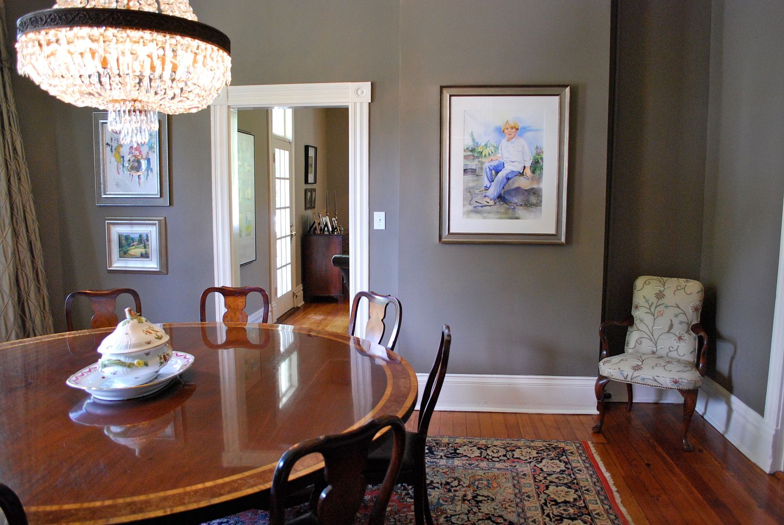
Dining Room
Here is the only before I have of the dining room. My clients sent me this picture at the beginning of the process. From the centerpiece, you can tell this picture was taken around Easter. But, it's really hard to tell much else about the space.
I did not take a before when we arrived at the house as the dining room was our "shopping" area and it was filled with accessories. Now for several Afters . . .
Again, we made some very subtle changes here - we moved the butler's tray to the bay window area and filled it with silver goblets and other drink ware. They we used the small wall to stack a pair of more modern oil painting for a gallery effect. While we can't change everything in the space, the style of artwork and how you choose to hang it can add lots of modern flare to a space.
This wall to the right of the doorway had a small display shelf with plates and figurines that was reading super traditional. Now, we've added another son's portrait to mix things up in here.
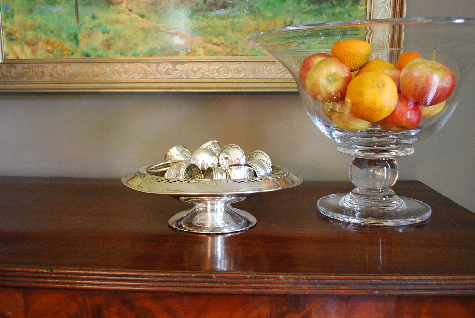
This is the painting from the living room which is very traditional in feel. So, we've added a clear glass pedestal bowl (that feels more modern) and mixed it with a more traditional pierced silver footed bowl for some contrast. Again, we are balancing the modern and traditional elements in this space.
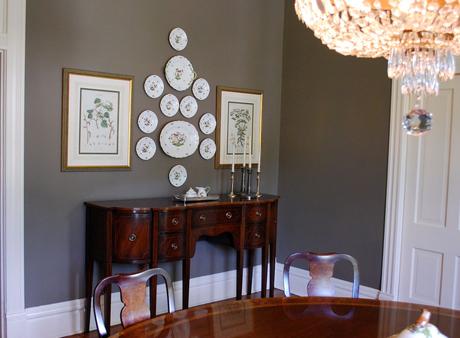
OK, this was one of my favorite things we did - our clients had a gorgeous collection of Herend china. It is really like art so we decided to use it over the buffet for some major impact. However, rather than just using the china, we decided to add the botanical prints on either side for a less conventional arrangement, making it feel more current.
Son's Bedroom
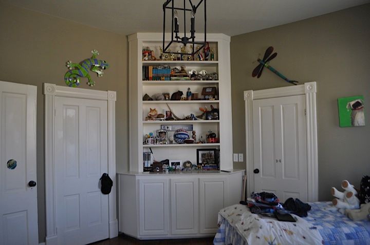
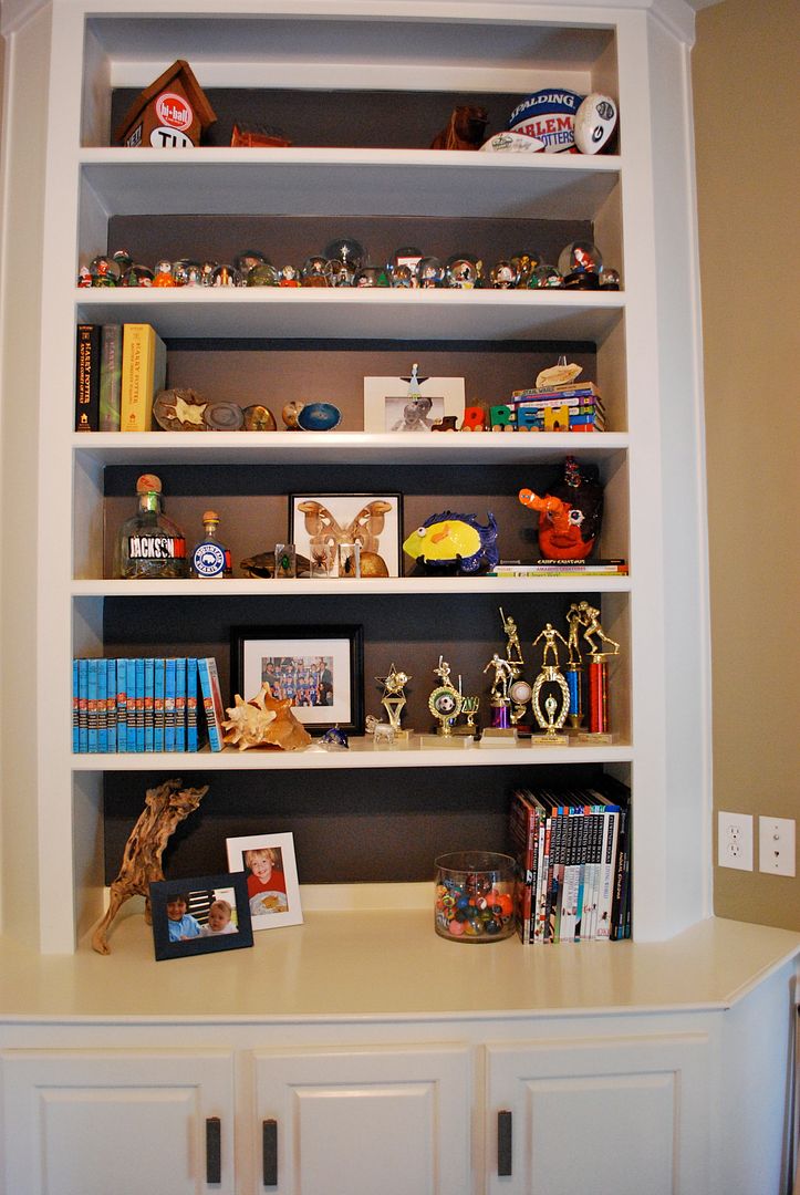
We also did a freshen up for one of the son's bedroom. Here is a before of the bookshelves in his room.
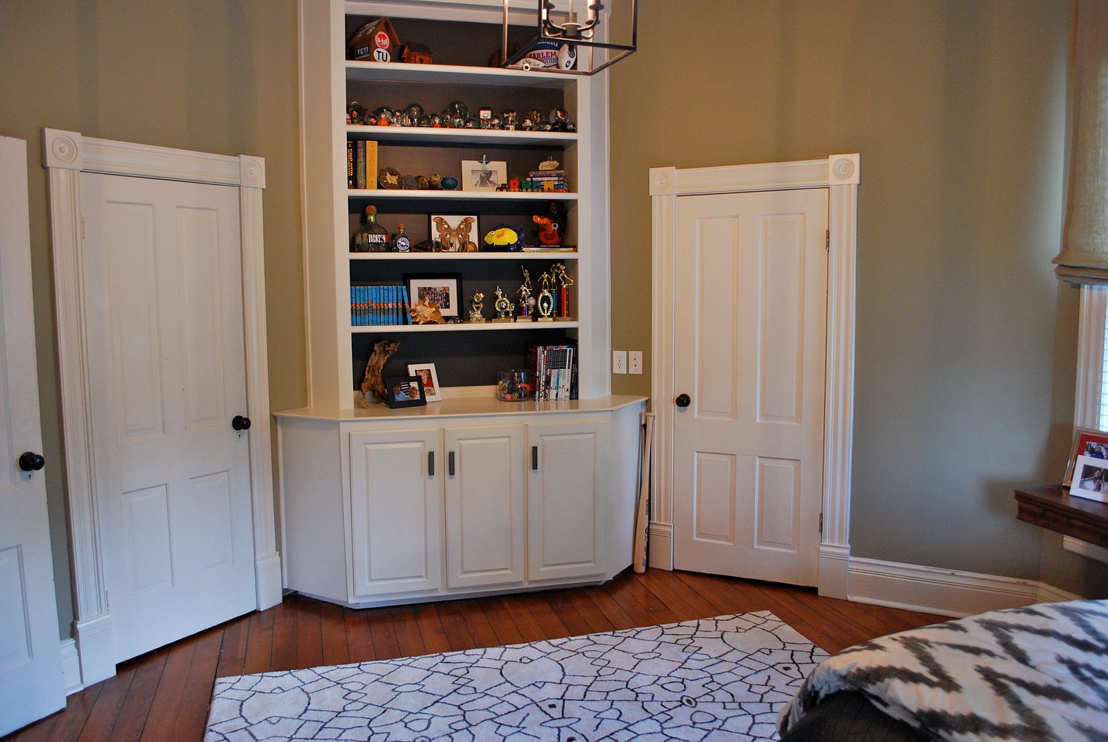
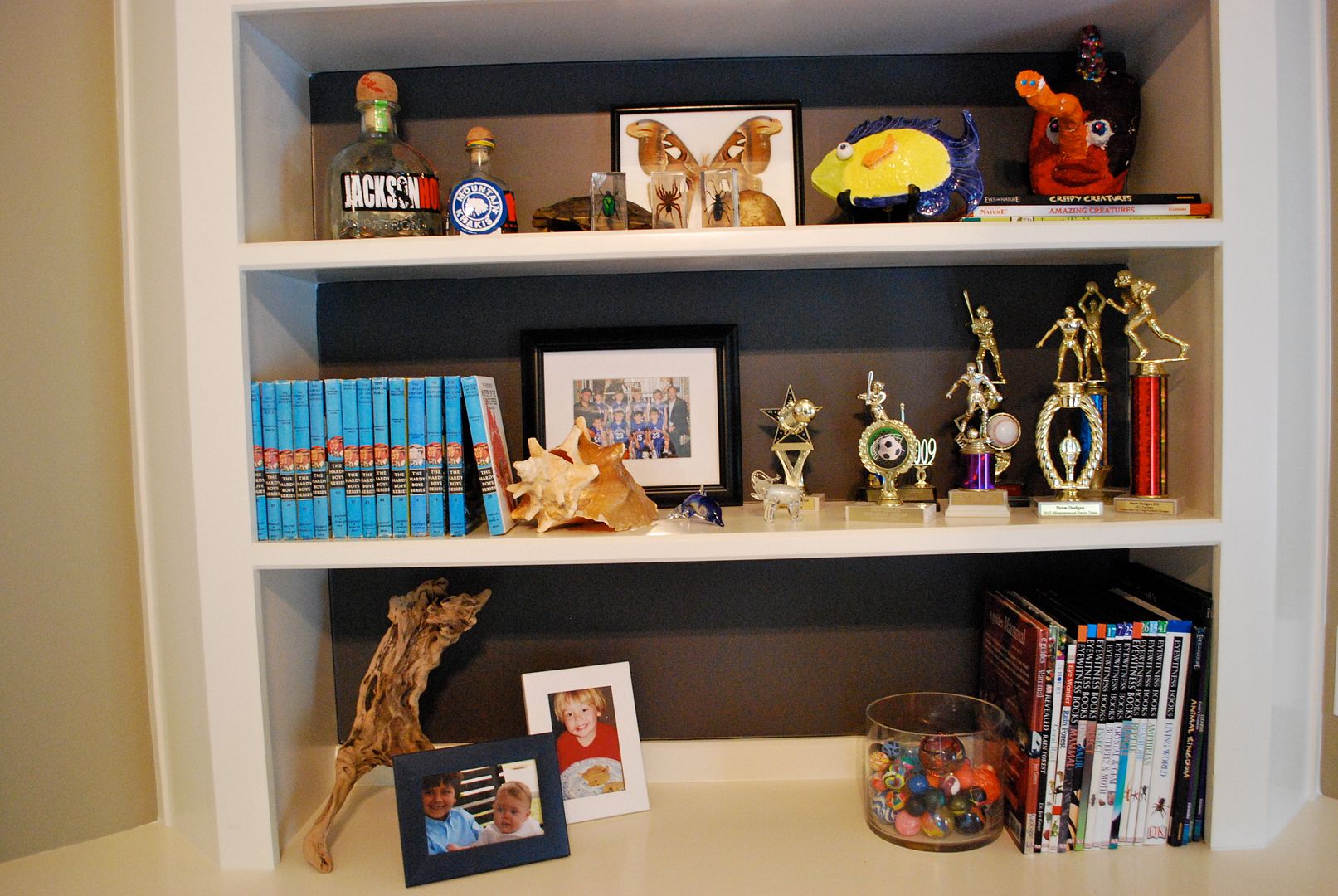
Now for a few afters (with the backs of the bookshelves painted a new accent color)
This child has the most extensive collection of snow globes that I've ever seen! It was hard not to get distracted and start playing with them.
A trick for creating a cleaner more organized look in bookshelves is to group like items.
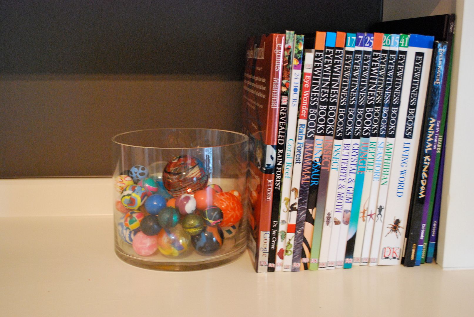
Even a container of bouncy balls and be interesting.
I hope your day is wonderful and it kicks off a very productive week for you! M.
Tidak ada komentar:
Posting Komentar