Tampilkan postingan dengan label Paint. Tampilkan semua postingan

Senin, 28 September 2015

If I Were Handy . . .

I would zip over to IKEA and pick up this for $299.00 . . . 

Then I would order some chalk paint which is very forgiving and easy to work with.  I would get it in this color . . . 


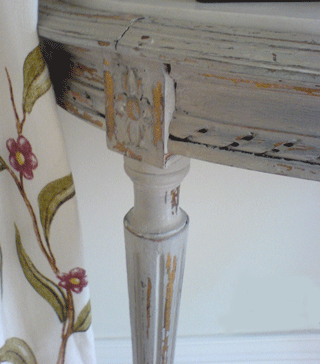
Then I would sand off a bit of the paint on the edges to let the original color show through like this . . . 


Then I would change the hardware to these ($4.76 each) . . . 


And get a very similar look to this for a fraction of the cost . . . 


This stunning piece retails for $1,500.00 and is on sale for $699.00 at Kings Lane this week.  


Artwork Tip: If you are in the Birmingham area and want to check out some amazing original artwork, my talented friend Ashley Terrell is in town showing off her work.  You can see and purchase her pieces on Thursday, September 29th from 10am-7pm at the home of Betts and Lauten Johnson (2201 Shades Crest Road). Ashley's calling the show "Art with Reach" which is so appropriately titled given her affordable prices!    Have a great day.  M.

Senin, 21 September 2015

Let's Go Craig's Listing - Pair of Bookshelves

A pair of narrow bookshelves for a steal of a deal at $75.00!

You could paint them with this . . . 

To make them look like this . . . 

And you could use them like this . . . 

Or this (image on the right).

I can't believe it's already Wednesday.  Hope your week is going well! M.


Minggu, 19 Juli 2015

"How To" Series: Picking a Great Paint Color

I hope everyone's summer is going great.  I can't believe how fast it's flying by.  I always feel this way after the 4th of July.  As a kid, I can remember thinking, "it's already half way over!"

 Since I feel like I am running out of time, I thought I better share a second installation of my summer "How To" series - Picking a Great Paint Color.  Hopefully, this will inspire some of you to get painting before summer completely gets away from us!


Source

We all know that paint is one of the easiest and least expensive ways to freshen up a space.  But, this is only true if you are able to pick the right color the first time!  With every trip back to the paint store, the price tag goes up.  So, here are some basic tips for picking the right paint color on your first try.

Dark colors will make a space feel intimate and cozy.

Source

While light colors will create an open and airy vibe.

Source

I have to confess I'm not a huge fan of dark or bright colors on the walls.  My only exception to this would be in a powder room or other small spot where you want to draw one's eye to a piece of artwork.  Otherwise, I am light colors all the way!

Source

Also remember, dark and bright colors will draw your eye to the walls, molding, and artwork of a space while light colors will allow the walls to fade away with the main focus on your furnishings, fabrics, and accessories.  See how the trim work pops in this space against the ebony walls?

Source

Would you ever paint a room orange?  It actually looks stunning here! Dying over those floors too.

Source

If you recall from preschool, the paint wheel is divided into cool and warm colors.  You will need to look at the furnishings already in your space and make sure you are selecting a paint that will compliment the undertones in your fabrics.  Warm undertones include red, orange red, orange, yellow orange, yellow and yellow green.  Cool tones include green blue green, blue, blue purple, purple, and red purple.

Source

In this great example from Tracery Interiors, the walls are a cool toned watery blue.  They have paired this cool tone color with neutral black and white fabrics and furnishings to allow the walls to pop, yet in a subtle way.  Really fresh look.


Source

 At first glance, this paint color appears to be a basic white; but it's really a warm toned white (with yellow undertones) as opposed to a cool toned white (with blue undertones).  As you can see, this color works wonderfully with the honey tones of the hardwood floors as well as the front doors.  It's beautiful.

Source


Here is an example of a cool toned neutral.  Here, they have kept the entire room cool by using accents of blue with grayish walls for a great overall look.

Source

If you are touring an idea house, dining at a friend's home, or driving down the street and notice a pretty exterior paint color, get brave and ask for the brand and name of the color! If it's a friend, they may even be willing to give you what is left in the can for you to slap on your walls for a test.  

Now, I realize this is not always a perfect solution (lighting, furnishings, etc. will effect the way a color reads in your home), but I promise you, it will get you closer to the right color than going into the paint store and pulling a tiny little swatch of color off a giant wall and ordering a gallon.


While we are on the subject of the giant wall of tiny little samples of color, here's another tip.  In order to pick the right color, you need to trust the color fan deck.  Always, ALWAYS look at all the colors on the color strip with your selection to figure out what undertones are in your pick.  It is also helpful to see where in the fan deck your pick is falling (i.e., is it in the blues, greens, pinks, etc).

For example, let's say you pick what appears to be a pretty cream color.  But when you look down the color strip, the last color on the strip with your cream is a hot pink.  You can rest assured that the cream you have selected has pink undertones in it (even if you can't see it on the swatch)! Do not try and convince yourself otherwise.  I hear this a lot, "I loved the color when I picked it on the swatch, but when I got it on the walls I noticed a pink tint to it, and that is NOT what I wanted."  


I am sure this is going to sound like a plug, but I think it has to be said, decorators deal with paint colors far more often than most homeowners.  They have their tried and true picks for every color you are attempting to attain and can easily help you pick a great color.  If you are not confident in making paint decisions, you will actually save time and money by hiring an expert to give you the perfect colors.

Moreover, decorators can help you decide when trim moldings, ceilings and doors should be painted dark or light colors to compliment your wall color.  Many decorators charge a flat fee for a paint schedule, so you know exactly what you are getting before they even arrive.

Source
The scenario, I give a client a custom paint schedule which they in turn give to their painter.   The paint goes up on the walls, and the homeowner calls to tell me they are not crazy about a color I selected.  My first question, did you use the brand of paint we selected the colors from or did your painter substitute a cheaper brand.  The answer: he substituted.  When they get a gallon of the paint we selected, they instantly see the difference.  

Trust me on this, if an exact color match could be obtained from brand to brand, there would be no price differences in paint.  The quality as well as the pigmentation used in a paint will dramatically effect the depth of color once it is on the wall.  It really does make a difference!  So, always select the colors from the paint you intend to use in the space. 

I hope these basic tips help you in thinking about paint.  It is the first line of defensive in freshening up a space!  For more information, this article has some excellent tips on selecting paint colors for you home.
Selecting Paint Colors

Have a wonderful day! M.

Kamis, 04 Juni 2015

Paint Trick - Creating a Focal Point

Last week, I helped a client with exterior paint colors for her very cute house.  While I did not take pictures of her house (sorry, sometimes, I get so busy with the task at hand I forget to snap a picture), we did come up with a beautiful schedule. 

The house is a ranch style combination of brick and sliding.  Also, the front door is set back into a covered area.  The current dark color on her front door makes the entire entry way blend into the house and go completely away.  

To make things even more interesting, the client has a bit of a dilemma - she really wants to paint the entire house (brick and siding), but it's cost prohibitive at the moment.  The siding and shutters are in need of painting, so they must be done now.  Also, her brick is a bit tricky.  It tends to make any beige/neutral turn peachy.

  So, we came up a plan she could implement in stages.  First, we selected a color for the siding and shutters.  We selected colors that work with the brick color but could be used (at a later date) as a whole house color, should she decide to paint the brick.

For the siding, we pulled BM - Sag Harbor Grey.  It has just enough grey to hold it's own next to the brick (no peachy here!).

For the shutters, BM - Dragon's Breath.  It's one of my favorite go to colors for shutters.  It is dark, but yet soft and sophisticated.  Just perfect for most applications where you need a black.  Also, in our case, the roof has a lot of brown, so a stark black (like BM Black Jack) would not have worked.


  Lastly, we selected a bright fun color for her front door.  Yelp.  That would be yellow.  This will brighten up the dark covered area and draw your eye to the entryway of her home (which, btw, is lovely and should be highlighted). 

BM - Sunbeam

Now, I know what you're thinking?!  Don't be afraid.  What sounds crazy, does not look crazy.  I promise. Here are a few inspiration images to give you the idea.


This is very modern home which looks nothing like my client's house; but the front door is set back in a dark alcove like that of my client's.  Notice how the bright color works to lighten that spot and makes the front door pop.  This is the idea. 


Here is another example of a front door that gets lost without a pop of color.  Yellow does the trick to instantly make it the focal point.

I'm not suggesting that every house needs a yellow door.  But in some cases, it's just what the doctor ordered.  Especially, if you want to make a house sing!  M.


Jumat, 01 Mei 2015

Power of Paint - An Update

If you recall, I recently completed a total transformation of my kitchen using paint and new hardware.  Here is the "After" of my kitchen.  If you want to see the "Befores" and the entire post about it, click here.

Following my post on the power of paint, I exchanged emails with Deborah, a blog follower in Madison, Mississippi.  She saw the post and was inspired to paint her own kitchen.  She was so gracious to share the before and after images of her space with us!  Here is the Before of Deborah's kitchen . . . 

She already had a great cabinetry color and decided to paint her walls the same color.  Look how much larger the entire space looks with the new wall color.  Wow - love a great before and after!

The previous color was P&L Arabesque which is a lovely rich color (I can totally see it as an accent color), and the new color is P&L Light Coffee.  This space opens into her keeping room, so she continued the color into that space as well.  Another "Before."

And the "After" (notice how the artwork really stands out now on the neutral wall).  It looks fantastic!

  Thank you, Deborah, for sharing these with us.  I hope they inspire other followers to think about freshening up with paint in their spaces.  It's one of the least expensive ways to get major impact! M.


Minggu, 19 April 2015

Color Stories Brand New at Benjamin Moore

Have any of you used the brand new color palette from Benjamin Moore called Color Stories?

  I saw it recently when I went in to buy paint for my media wall project.  I'm told the line was created to compete with Farrow and Ball (which is not available locally).  So, I'm dying to get my paws on a fan deck!  If any of you have tried the new colors,  I would love to hear your thoughts and favorites. 


Also, I learned something else during my visit - Do you know how to tell whether you have oil or latex paint on a surface without having to lug it into the paint store with you?
  
The test: simply rub denatured alcohol (aka finger polish remover) on the painted surface.  If the paint comes off on the cotton ball it's latex, if not it's oil based.  It's that easy! M.

PS: We are very close to finishing our media room project, so stayed tuned.  I promise to show you pictures as soon as I'm finished. 

Jumat, 03 April 2015

DIY - Painting Shutters

For the past year, our shutters have needed attention.  I'm sure my neighbors were thinking, "We were wondering if you noticed!"  I definitely did - but, as we all know, life just seems to get in the way and the shutters never made it to the list.  Back in November I thought, it's now or never for this year.  So, we got busy.  
When we moved into this house, the shutters were stained, but in need of a refinish.  We hired a guy to do this for us.  It was expensive and took two weeks.  So, this time, I decided we just needed to paint them (the doors were still in great shape, so we just focused on the shutters).  
Since this was going to be a "quick" DIY job, I managed to talk my husband into helping me.  It was really not a difficult job.  In fact, Chris at Sherwin Williams in Homewood, gave me everything we needed and a lesson on how to do it.  

But, quick it was not.  We painted the entire weekend and still did not finish.  We took a break and finished up the following Saturday.  I know we saved some money, but my question is how valuable is your weekend time with your family?  I'm glad we did it, but not sure I would take it on again any time soon!  

For those who think it's worth your time, here's how we did it.

Step 1
Sand any loose chipping paint from the shutters and wipe them down with a clean damp cloth.
Step 2
Tape off the area to prepare for painting.  This step was crucial for us.  In fact, with the first swipe of my brush, it was all over the tape and I thought, "Wow . . . totally worth the extra time."
Step 3
Apply one coat of the proper primer (ask your paint specialist what you'll need).  Since our shutters were previously stained and varnished, we had to start with a primer that sealed them and allowed you to then go back over them with a latex paint.   
This stuff was as thick as fudge sauce and my arm was killing me when we finished.  But, an ibuprofen and glass of wine later, I was fine!
Step 4
Apply your paint color of choice.  Since the primer we had to use could not be tinted the same color as the paint, it took two coats to do the job.  

I really think we needed three, but realized the second Saturday that I would not be squeezing another coat out of the man, so I'm good with two!  Let's just pretend the pumpkins are not in the picture.  K? (After we finished this job, I got so busy with client projects that I did not have time to draft a post about it - thus the pumpkins in the picture.)  But you get the idea!  

I have a few DIY projects on the list for 2012 and will share them with you in the near future.  What about you?  What do you have on the list this year? M.