Tampilkan postingan dengan label Before and Afters. Tampilkan semua postingan

Jumat, 13 November 2015

Curb Appeal - Before and After

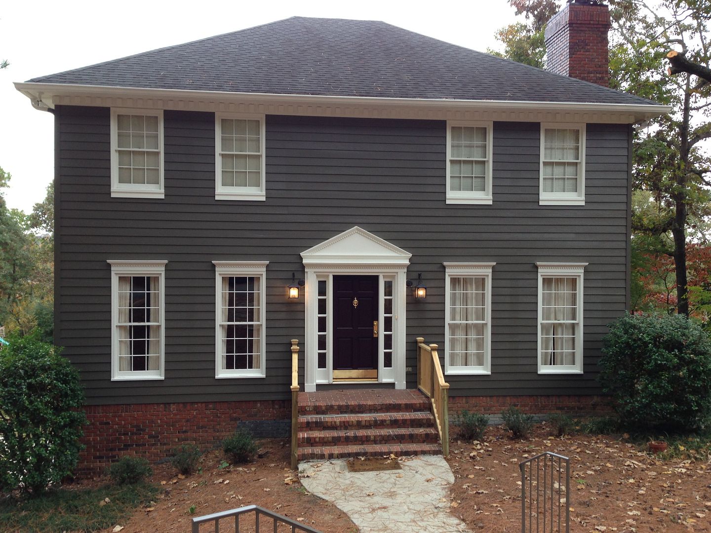
Back in the summer, I had a client contact me who was getting ready to paint the exterior of her house.  She saw the post I did on another exterior paint project (click here for those details) and wanted my thoughts for her house.  It's been several months and my client has been busy implementing the plan.  She has also been so sweet to continue to send me pictures of the progress.  I thought it was time to share them with you.   

My clients have a lovely saltbox which is a Colonial style of architecture originating in New England.  In all honestly, they were not unhappy with the look of the home - just curious of how it could look if painted differently.  So, I came up with a new paint schedule and recommended a few edits and additions.  

Here's where we started. . .  the before.   


And here's where are we now . . .  the after. 

Since many traditional saltbox style homes do not include shutters, I recommended we edit these.  By removing the shutters, you actually see more of the base paint color giving the home a stately feel.  In addition to the removal of the shutters, I recommended adding some interest to the area above the front door.  Many saltbox homes have an additional window above the front door which adds interest.  Since we did not have this, adding a pediment over the doorway was really essential.  This not only draws your eye up to accent the height of the home, it also helps to provide depth to the facade of the home which was very flat.  One benefit I really did not appreciate when we created the plan was how the dark gray paint plays next to the brick foundation and chimney.  Just love how rich the brick looks now! 

There are still a few items on the list, but we are very close to completion.  The new railing which is more mission in style still needs to be painted the trim color.  Also, the plan is to add more trim work to the bottom of the upper windows to give them more weight and presence.  But just had to show you the progress!  Happy Wednesday. M.


Minggu, 20 September 2015

A Redesign

Happy Friday! Do you ever get a song in your head that you can't seem to shake?  A couple of weeks ago we were in Knoxville for a soccer tournament for my daughter.  One of the parents would yell "pressure!" every time their daughter got the ball and inevitably my brain would start playing "Under Pressure" by Queen.  Weird, I know.  I had to come home and download it on iTunes - still a great song. 

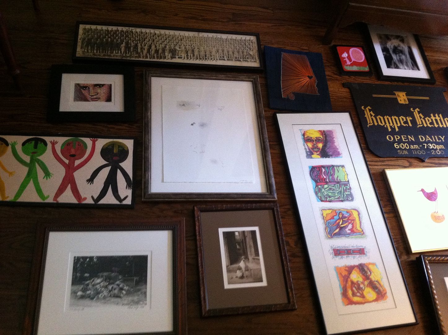
Sorry to digress - none of the above has anything to do with today's post!  Today, I wanted to show you a few pictures of a redesign I did last week.  While I love creating design plans, my favorite project is still a redesign.  This is using what a client already has in their home to create a completely new and fresh space!  I love their reaction when they see things they've purchased and love in a whole new way.  Also, the final result is always an unusual mix of found objects you just can't accomplish with all new items.  So, here's what we did.  Caveat: Some of the pictures are blurry as I took them with my phone, so please excuse the quality.  As usual, I was so excited to get started that I forgot to bring the camera.  So, when we arrived that morning, this is what we had to work with - a clean slate (it saves time if the client pulls everything down, so we can get to work).  This is the wall you see when entering the home.

It was just begging to become a gallery wall!  Also, I did not take any wide shots of the room, so I thought I would show you the layout of this cozy cottage.  Originally, the sofa was on the window wall and the gallery wall had a small chest flanked with a pair of armless chairs.  One large piece of artwork hung on the large wall.  When I saw the space for the first time and all the incredible artwork this client had collect over the years (which was all stored), I knew we needed a new layout so we could display all that incredible artwork.  Here's the before:
After several tries on the new layout (we are not dealing with a lot of space, people, so furniture placement was very challenging!), we came up with this new layout which gave us that big fabulous wall for artwork.


When creating a gallery wall, it's important to lay the artwork out on the floor to really get the best result.  This will allow you to play with the shape of the frames, the color of the artwork and how the two play off of each other in the finished gallery wall.  Also, it will allow you to see the finished size of the grouping to make sure it will fit on your wall!  Here are a couple of shots of our layout (it was so large, I had to take it in sections). 


By taking a picture of the placement when it's on the floor, it actually helps you to remember exactly where each piece is in relation to the others (this is sometimes difficult to remember once you begin to hanging the pieces on the wall).


So, here is a picture of the final wall.  You can see, we adjusted the wall a bit from the floor layout, but I just love the result - wishing I had such fabulous artwork for my own space! 


And here are a couple of other spots in the room we freshened up with artwork and styling.
As an aside, the TV will be hung over the fireplace.  I've had lots of conversations with clients lately about whether it's "proper" to put the TV over the fireplace.  While I love a room with the TV completely hidden, sometimes the best layout for the room will dictate TV placement over the fireplace.  This is a very small living room.  The only other wall (other than over the fireplace) where the TV could go would be our fabulous gallery wall. So, we opted to put it over the fireplace.  The writing desk was in a guest bedroom and the shield mirror was in a closet.  Initially we had the military picture included on the gallery wall, but decided this side of the room needed more height (you will understand when you see the wall to the right of the fireplace).  Stacking artwork is a great trick to give you some symmetry for walls on either side of a focal point like a fireplace.


Sorry this picture is so blurry (below).  This is the wall to the right of the fireplace where the armoire was initially placed.  Wish this picture were clearer as the series of artwork is from a favorite artist, Kate Merritt Davis.  I have one of her pieces in my own kitchen! 


Then we moved the large piece of artwork that was on our now gallery wall to a small wall separating the living space from the dining area.  This created an entry way feel.  We toyed with the idea of painting the side of the bookshelves the wall color just to give us a larger wall for this chest, but in the end, all the trim work/detail in this spot would have looked a bit off (hard to decide where to stop the wall color without it feeling strange).  So, instead, we placed a basket in that spot to be used to store shoes, or umbrellas, etc.  It also added lots of texture in a layered way. (see our note to the client of what she could use this for!)


One last picture, we also restyled the bookshelves for a fresh look next to the gallery wall.  


There are a few new furniture pieces coming into the space.  Once they arrive, I'll have to get additional pictures to show you.  Happy Weekend.  M.


Senin, 24 Agustus 2015

Picture Hanging Details

On Monday, I posted about hanging pictures from a brass chain to get extra impact from your artwork.  It was such an easy project I wanted to share with you what I used and how I did it. 


Step One
Get a plan - Dig around your house and find some artwork.  (It may even be stored in a box at the moment).  The goal here is to use something you already have on hand.  Then, find a wall in your home where you're looking to add some impact with artwork.

Step Two
Hang the artwork on the wall as you normally would with a simple nail or picture hook. (The chain is just going to be used to get the look, not support the piece.)  I chose to hang my prints lower than usual, to fill up more wall space and allow your eye to notice the chain detail.  As you can see from this picture, the bottom of the artwork is almost even with the bottom of the light switch to the right.  Obviously, you will need to take into consideration the size of your artwork and ceiling heights to get the right placement.  


Step Three
Measure the width of your artwork and divide this number by three to get the proper placement of the chain.  As I tell my son, "wake up those brain cells!!!" For example, my piece was 21 inches wide.  So, 21 divided by 3 is 7 inches.  So, the chain should hang 7 inches from the outside edge on each piece.  BTW, it is very important to measure this (don't eye ball it)!  Your eye will be drawn to the chain, and if it isn't even, it will not look right. 

Step Four
Using a yard stick and a level, mark the points on the ceiling where the cup hooks will go based on the calculations above (this will hold the chain), and screw the hooks in place.  I have crown molding which required I place the hooks just below it.  If you don't have molding near your ceiling, you can either place the hooks just near the ceiling or it would look great if you placed the hooks directly into the ceiling nearest the wall. 

I purchased two different sizes of cup hooks and ended up going with the larger one because my chain would not fit in the curve of the smaller hook.  Here's a link to the one I ended up using - Large Brass Cup Hook

Step Five
Select a flat chain for this project so that the picture will lie flat to the wall.  I used Brass Sash Chain, but you could also use this or even this if you liked the look better.  Also, I used brass for my project because I had a gold frame.  I think it looks best to coordinate the color of the chain with the frame color.

Step Six
Place your chain on the hook and then cut it (with wire cutters) 3 inches longer than the top of the picture.  You want to have a bit of chain to tuck behind the picture. 

 And that's it!!! You now have a picture with impact.  One last word of caution.  This project is so easy and inexpensive that it's tempting to do it in every room.  Don't!!! These types of touches really loose their impact when you use it multiple times in your house.  So refrain! 
I would love to hear from you, if you do this project in your home! Have a good one.  M.

Kamis, 16 Juli 2015

Before And Afters - A Move In

One of my favorite projects to complete is a "move in" design.   This is where a client moves into a new home, unpacks and calls me to come in and pull the whole thing together.  Last week, I had the opportunity to do just that for a sweet family in Mountain Brook.  Here are a few before and after pictures of the project.  Also, I should mention, there is not a single new furnishing used in this project.  Everything came from the client's previous home.  When you've just spent your money on buying a home, it's hard to think about purchasing new furniture.  The key is to use what you have and then fill in the blanks as your budget allows.

Foyer
This is the first thing you see when you enter the home.  The space straight ahead is the family room, and the opening to the right leads to the dining room.  Please remember on these "Before" pictures, my clients have just moved into this home.  It is still in a state of "boxes" everywhere! 
A few weeks ago, I selected new paint colors for the entire house.  After closing on the property, my clients had painters come in and complete the schedule.  I should have taken pictures of the rooms with the original paint color, but I did not.  Sorry.  I really need to remember to take more pictures of projects.  Here is the new foyer!  We really wanted to keep it simple and clean - this makes the foyer feel larger. Love the parquet floors in this room! 

If it's in the budget, I highly recommend painting before moving into a new space.  Painting always creates a clean, fresh new palette to begin layering in your furnishings.   
When creating furniture layouts for your rooms, it is important to think about how the secondary rooms look when entering your home.  These small views into spaces just off your foyer really create a first impression.  So, it's important to make them interesting. 
Dining Room
This room is just off the foyer and was used by the previous owners as a formal living room.  My clients are very practical and interested in using all the rooms in their home.  They also have a large extended family and enjoy getting together for family dinners.  So, this large living room was the perfect choice for a dining space.  The scale of the room really accommodates their substantial dining table which would have felt cramped in the original dining space.
Prior to arriving, I asked my client to place all the artwork, lamps and accessories in one room - so I could easily "shop" her accessories.  The dining room is our "shopping" room.  So, that's why there is so much stuff in this space in the before pictures!


Now for the "After" - Notice we flipped the china cabinet and the buffet in the space.  The buffet fills this large wall nicely and creates a wonderful focal point as you enter the home.  
Here is a view in the other direction - looking into the foyer.  I love having the smaller table for dessert service, beverages, or even overflow from the buffet.  It is nice to have one extra table top in your dining room.  This table is a drop leaf which can be opened and even used as a "children's table" during a large family gathering.  
The chandelier in the former dining room will be moved to this space to finish the look.  A couple of orchids on the silver tray in the center of the dining table, and they are ready for a party!
We moved the china cabinet to the smaller wall between the windows; and once we have selected drapery panels, it will softened the entire look of the room.  I love the silhouettes of her children, but they were not large enough to ground the wall.  So, we grouped them with some black and white photographs to fill that space.

Study/Computer Room
As I mentioned, this couple really wanted to use the rooms in their new home and saw no need for a formal living room.  So, we transformed the original dining room into a study/computer room for everyday use.  This room is just off the new dining room and also opens to the kitchen.  As an aside, do you see their cute dog peeking around the corner looking at me?! He's thinking, "Who invited her to the party?"  
In the picture below (it's difficult to see), the walls are covered in a grass cloth wallpaper which was painted a burgundy color when they bought the house and the fourth wall has a mirror above the chair rail. 
We discussed removing the mirrors but realized we would either have to remove all the grass cloth or find a similar wallpaper to match the remaining walls.  Since this was simply not in the budget, we decided to paint the grass cloth a neutral color and work with the mirrors in the finished space.   Also notice, the family computer is included in this space.  My client really wanted it to be near the kitchen for homework help and general use.   But, it is open to the more formal dining room area, so it needed to look nice.  

We decided to go with a casual elegant feel for the space.  Below is what you see when you enter the foyer. 

I love the antique writing desk, but it was too heavy for the mirrored wall.  So, we flipped it to the only other wall in the space.  Also, since this is the computer room, storage is very important.  We've suggested a large french basket to go under this piece for additional storage in the space.  
What did we do with the mirrored wall?  We used it as a gallery wall.  This is such an easy trick.  All you need are some light weight artwork pieces (like canvases) and some industrial strength double stick velcro. You have to be sure on placement, because you only get one shot at getting it right.  When it sticks, it sticks. 
We edited the office style computer table and opted for a beautiful drop leaf piece for a more elegant feel to this space. The upholstered chair was too large in scale for the space.  So, it was moved to the playroom downstairs.  The ottoman we kept in the space.  It works great as a coffee table and for additional seating when needed.  My client is a fabulous seamstress, and I have sourced a neutral linen fabric for her to use for a slipcover for the ottoman.  This will make the space feel more cohesive and give them the option of washing it when needed. 
I have to say, her cute dog was totally confused by the entire experience.  I really did not notice how many pictures he's in until I starting putting this post together!  He simply could not figure out what we were doing. 

Family Room
This is the room where this family spends most of their time.  So, I wanted it to be both comfortable and beautiful.  Originally, the movers placed the TV on this wall because that is where the cable outlet was placed.  I can't tell you how many people work an entire room around the cable guy's decision to put a cable somewhere.  I was not crazy about this being the first thing you see when you enter the home.  So, we moved it to the wall opposite the fireplace and called the cable guy! 

We also had the backs and sides of the bookshelves painted a contrasting color - just love how they turned out.  Then, we painted the fireplace the same as the wall color to make the wall feel more cohesive and bigger.   With the door, wall, fireplace, and windows, this wall felt very choppy before painting it. 
Also, a very important thing to remember when styling a home.  Can you pick out the husband's favorite chair in the picture below?  Notice where it is in relation to the TV?  You have to keep this in mind when coming up with a new layout for any space - the hubby has to be able to see the TV from his chair.  It can't just be pretty - it has to work. 
Now, this is what you see when you enter the foyer.  I think pulling the upholstered pieces off the wall and creating a vignette on the large wall makes the entire space more interesting.  I have sourced a pair of affordable accent chairs to go on either side of the bamboo piece to give this wall more visual weight without taking up a ton of space.  Then, linen panels will frame the view from this gorgeous window. 


My client has a beautiful collection of crosses.  Grouped together they make a wonderful art installation on the narrow wall by the fireplace.  Also, notice the husband can see the TV very comfortably from his new spot in the room.  The room has very little light; so I have source a floor lamp which will live on the other side of the husband's chair for reading.  It is so important to include lighting of different levels in a space.  It can bring a room from ok to really great if you incorporate the right lighting.


Sorry for such a long post!  I didn't realize how many pictures I was taking, but I really wanted to give you a feel for the layout and flow of this house.  I hope you had a wonderful weekend!  M.