Tampilkan postingan dengan label Fabrics. Tampilkan semua postingan

Senin, 07 Desember 2015

Project in Progress - Guest Bedroom

I did an installation this week for a guest bedroom in a beautiful home in Vestavia Hills.  I posted about a redesign I did back in October here for the same client.  After we finished moving furnishings around in her home, my client wanted to freshen up one of her guest bedrooms.  So, we used furnishings and accessories she already had and unified the space with new bedding. 

The zebra print chair was our jumping off point.  

In order to make the different styles of furniture work, I added a hint of Asian (which always does the trick) with these fantastic Chiang Mai pillows by Schumacher.  

By pairing these with the larger, less expensive trellis pattern pillows, you get the impact of the Chiang Mai without spending a fortune. 

If you've ever seen this fabric in person, you know the pictures do NOT do it justice.   The color is so incredibly saturated and the fabric is the most perfectly textured linen EVER.
Ah- maze-ing.   Makes my mouth water when I think about it.  

So, with the help of a couple of new fresh fabrics, you have a new guest bedroom.  Happy mid-week. M.

Kamis, 17 September 2015

Falling Into Fall - Part I

Since Fall is upon us, I thought it would fun to discuss a few ways you can give your home some seasonal accents without breaking the bank.  Today, I want to talk about the use of fabrics to accomplish this.  You don't have to reupholster a chair or sofa to get this look either.  The most affordable ways are through pillows, throws, slipcovers and even strips of fabric used in clever ways to give you a custom look.  

Often clients will tell me Fall colors don't go with the colors of their home.  So, their solution is to simply ignore the season and wait for Winter.  This is usually the case with cool tone interiors such as blues, grays, pinks, and lavenders.  There are ways to give these colors a Fall take.   But first lets look at the easier of the two - warm toned interiors.  The traditional colors of Fall - oranges, reds and yellows work great to give you the look if you already have a warm toned base in your space.

Warm Toned Interiors
Color blocking with orange and red velvet pillows does the trick.  Simple. Simple.  These pillows have turned this white beachy style into a cozy Fall retreat.  The rug helps too!
Architectural Digest


This works in bedrooms too.  By adding an orange blanket or duvet and just one fabulous pillow (I think this is Schumacher - Zanabar), you are there.

Look what a simple throw can do . . .  (add cut branches of leaves from the garden to a clear glass vase and you've repeated the color for amazing results).  I think it's interesting that once you added a color, any other items in the room that have that color starting speaking to it.  Did you notice the books on the console table that have orange/red yellow covers?  And the bits of rust in the painting?    

Again, color blocking with orange velvet pillows and a throw.

Cool Toned Interiors
OK, so easy peasy if you have warm tones.  But what about the cool tones.  If you have cool undertones like grays and blues, what do you do?  You go for browns and greens.  You will be amazed what this can do.

In this example, the striped pillow does the trick.  Honestly, I think it is styled for Spring since you have the yellow vases, but change these to more muted tones and you are there.
via 


In addition to color, think patterns that speak to Fall - plaids, strips and even florals in the right tones all speak to Fall.  Also, don't forget texture - flannel, wool and cashmere.

In this image there is not a bit of orange/yellow/red.  But it still feels like Fall to me with the camel throw and plaid.  So cozy.
via

Earlier, I mentioned strips of fabric to change the look.  You can take a strip of any Fall fabric, and change the look of a wingback chair (you could even have it monogrammed).   Sort of like this example with the chocolate flannel . . .  (sorry it's blurry, I took it with my iPhone).

And just because I'm feeling generous, here are a few of my favorite fall fabric finds.  Any of these could be custom made into pillows, slipcovers and even those super cool strips of fabric to be used on sofas, accent and dining chairs for added texture.

Favorite Go To Fall Fabrics
Spice Velvet
via

Blue/Grey Plaid

Embrodered Linen


Camel Houndstooth

GEO Cut Velvet

Enjoy your day, everybody.  M.


Rabu, 16 September 2015

Emerging Trend - Arrow Design

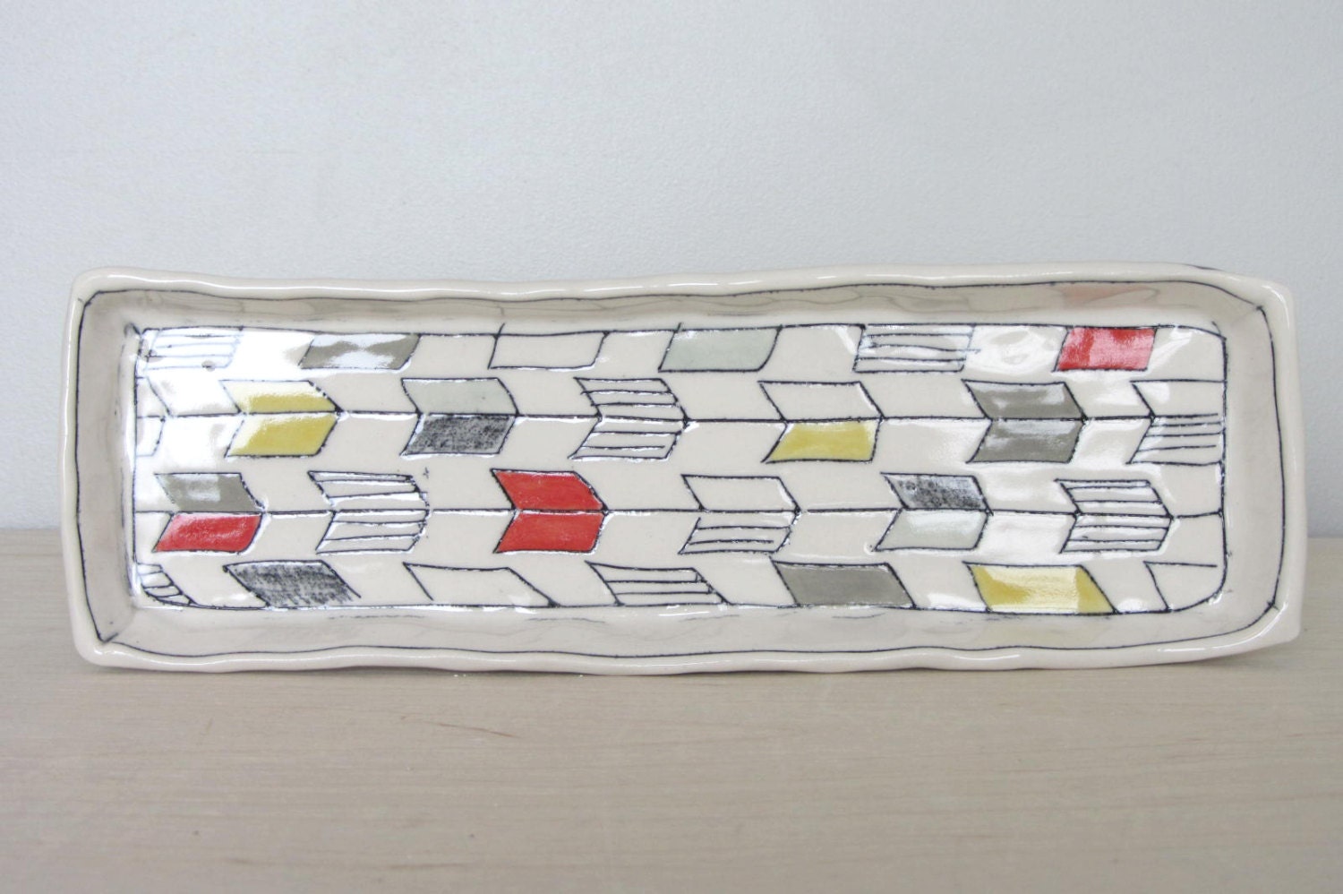
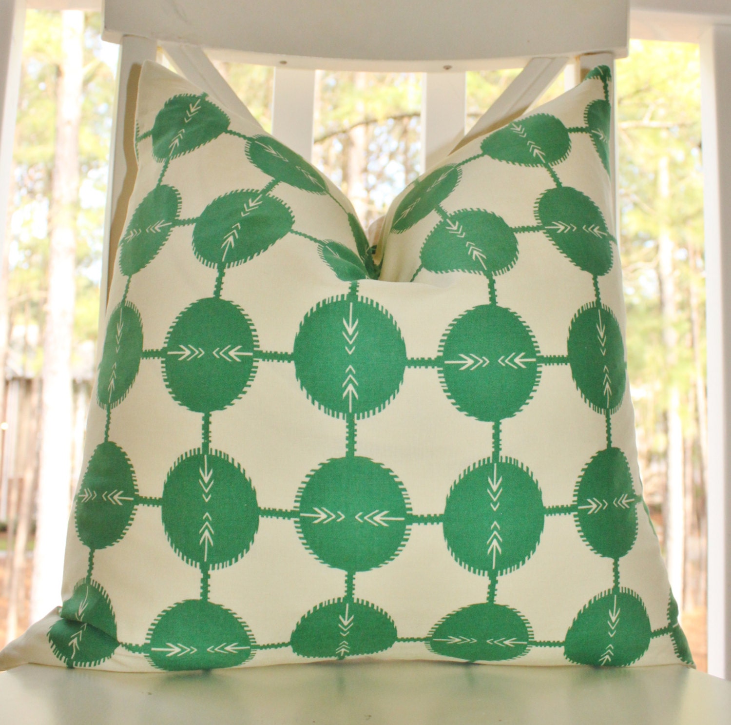
I love it when I begin to see a new trend.  This one is an "arrow" (also called "feather") design.  It's similar to a chevron pattern, but fresher.  I dare say more youthful and fun.  Have you noticed it as of late?
via

I started seeing all different versions of it popping up when sourcing fabrics back in the Spring.  Now, it's more than fabrics - I'm seeing wallpapers and even accessories like trays, jars and bathroom accessories.


I can see using this pattern just as you would a chevron either as the main accent fabric (if it has several colors in it) or as a secondary fabric (if it's a two color fabric like below). 


Just love this take on the trend - it feels tribal and modern all at the same time.

via

I will definitely be working this into a design plan soon.  Happy Monday! M.


Minggu, 13 September 2015

Project in Progress - Master Bedroom

I've posted about this particular project before.  At one point, I talked to you about stairwell lighting in this fabulous Mountain Brook house.  We are now working on fabrics for various rooms.  These selections we are considering for the master bedroom.

The room has a lot of green in it already and these fabrics will really compliment what she already has going on in there.  Fabrics are really one of my favorite steps in the process.  I think they can do wonders to freshen up a space without totally breaking the bank. 

The bed has a creamy linen headboard the client purchased years ago, and it still looks great.  We also moved a pair of sage green leather arm chairs into the space and placed them in front of the fireplace.  They were originally in her family room, and the scale was just not working.  So, now they look fantastic as a place to watch TV and enjoy a cozy fire.  For the leather chairs, we are repurposing a pair of chocolate and green pillows she already had in the bedroom.  They are in a simple foliage pattern.

For the bed, we are considering this bird fabric trimmed in a green silk flat flange.  This is such a beautiful, versatile fabric.  I have used it in a different bedroom and gotten a completely different look by accenting the peaching tones in the birds (this picture makes the peachy color look orange and it's really more subtle). 

The chocolate and blue fretwork fabric (below) will also be included on the bed, along with a deep chocolate velvet pillow the homeowner already had in the space. The center fabric, which looks like a combination of paisleys and damask pattern, will be a lumbar pillow in a third danish modern chair we are using to ground a corner and designate reading nook. 

Remember, you don't have to start completely over when redesigning a space.  By using just a few additional pillows in fresh fabrics with what you already have, the entire space will feel new.

Once we are completely finished with the makeover, I will show you the results!! M.

Jumat, 11 September 2015

Alessandra Branca for Schumacher

Back in January, I was interviewed by Birmingham Home and Garden as a Tastemaker for trends in 2013.  One of the trends I mentioned was the 1980's floral resurgence.  I also posted about it almost a year ago when I first began to notice the florals popping up - Trend Spotting 80's Floral

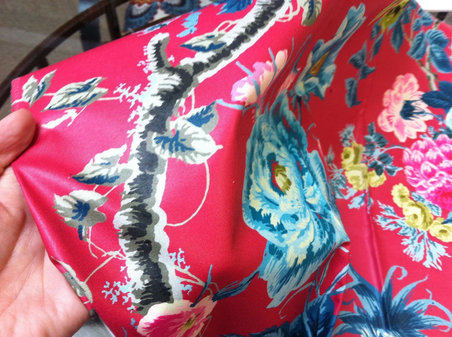
Fast forward nine months and this trend is in full swing - case in point, Alessandra Branca collection for Schumacher.  The colors are extraordinary in this collection.  The number of colors in the signature fabric is over the top.  Also, it very hard to tell from the images I snapped while at the design center, but the floral fabric below is a chintz!  Then the IKAT chevron is a polished cotton.  

While it does take some getting used to - deep breaths really.  When I look at the floral pattern on it own, I have flash backs of college and all the dorm rooms my freshmen year.

But, when it's paired with current wovens and fretwork patterns, it feels fresh to me.  Much more hip and chic than my college days.  

Also, in the more muted colorways like this citrine with blacks and deep greys, it feels much more current to me.  All these are part of the same collection.  I love that she's included lots of secondary patterns to soften the busy floral. 

So, what do you think?  Are you ready for a blast from the past?! M.


Rabu, 09 September 2015

Hand Painted Velvet - Follow up

Do you remember this tease of a post I blogged about back in May?  See the entire post here.  If you recall, I showed you this picture in my post. . . .
 

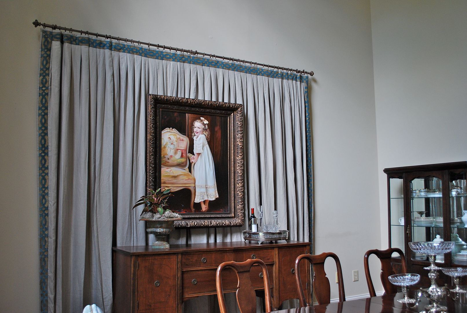
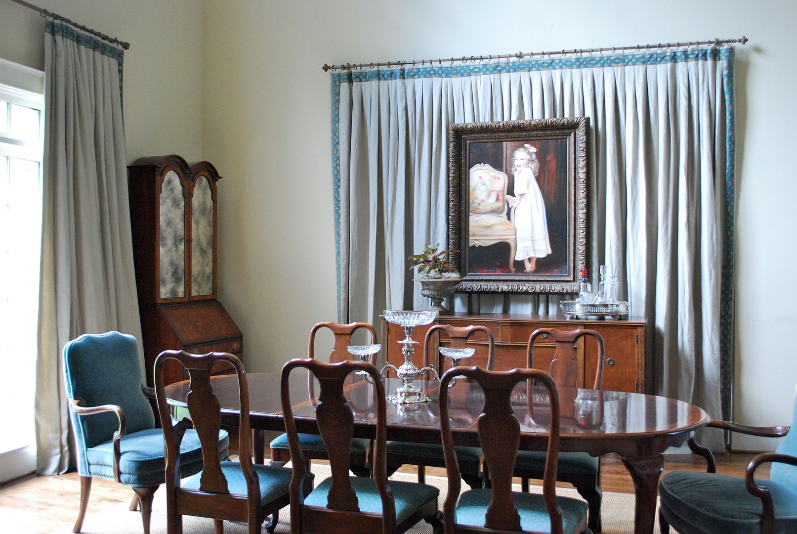
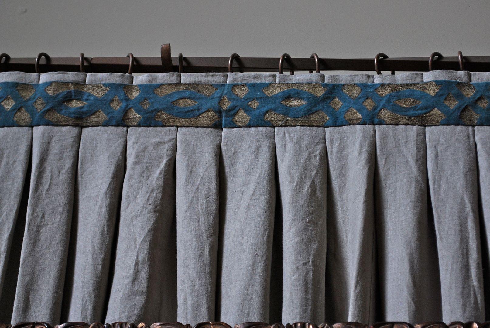
I know, it was mean of me not to give you the details, but we had just started this project; and I really wanted to save the reveal once the installation was complete.  I had visited the studio of the very talented Kitty White, and had fallen in love with these hand painted strips of fabric.  We began to collaborate on this project, and came up with a wonderful hand dyed velvet trim to pick up the tone of the teal colored mohair host and hostess chairs.  Kitty then painted a metallic paint onto the fabric and re-dyed the velvet for a wore look.  The process was quite meticulous but the results were well worth it.

Here's the result . . . 

Kitty White is truly one of the most creative people I've ever met.  Not only is she a fabulous decorator and artist, she also designs some of the most stunning jewelry I've ever seen.  Her studio is in a carriage house behind her home and the entire space is totally enchanting.  If you are interested in something similar for your home, please contact her.  Just a visit to her studio will inspire you beyond words!    

When we started this project, the room was actually a formal living room.  My clients never really used the living room and were in need of some office/homework space on the main floor.  

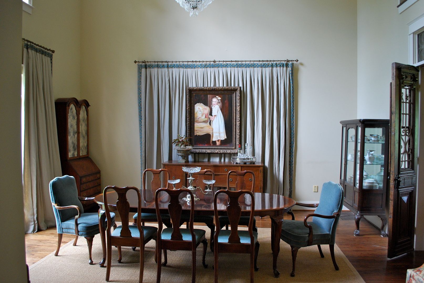
Also, they did not want to permanently alter the floor plan of the house.  So, we decided to visually close the large opening between the formal dining room and living room by using the linen drapery panel.  Here's a close up of the tape.  Since our plan was to layer the artwork on top, I chose an inverted flat pleat on the tops of the drapery panels.  

Once the dining room was in it's new spot, we created the office space in the room beyond (which can now be accessed through the kitchen area).  As an aside, the doorway was not center on this wall, so we used the drapery panel to center the buffet on the accent wall.  

The result - a marvelous focal wall in the dining room.   As you can see, the oil painting over the buffet appears to be floating on top of the drapery panel.  I will be posting later on how we accomplished this. Since we had two story ceilings in this room, we had to be very clever on how we hung the painting. 

I promise to share the trick with you very soon!  Until then, I hope you have a marvelous start to your week! M.


Senin, 07 September 2015

Project in Progress - Family Room

Just picked up a few fabric samples I'm considering for a family room project I'm working on at the moment.  The homeowner just renovated the kitchen and opened it up to the family room.  It is a stunning space and I promise to show you pictures soon.  We are going for a rustic, traditional retreat with a modern twist.

The walls have been painted Ben Moore Coastal Fog 976.


And we are including a pair of these chandeliers in the vaulted area of the ceiling (it's a huge space).

And here's a sneak peek of a few of the fabrics . . . 

It's hard to fully appreciate the main accent fabric from the small sample above.  It's a very large scale floral.  What I love most is being able to hand pick the portion of the pattern you want to use on pillows.  Here's a picture that shows more of the pattern.  

There are several fabrics we are still waiting for memos on- a woven linen for the four skirted swivel chairs, rich leathers for the winged back accent chair and ottoman, and secondary fabrics for pillows on all the upholstered pieces.  Fabrics have to be one of my favorite things about interior design!  Selecting them is right up there with shoe shopping for me.  
Have a great weekend! M.

Sabtu, 15 Agustus 2015

Width Decorative Tapes

Just pulled these fabulous new decorative tapes for a project I'm working on at the moment - at least two of them will be making their way into a design plan for one lucky client!   All those shown below are brand new for Fabricut.  Just loving the widths of them and the color options.  Very yummy! 

Here's a close up of the color detail in one example . . .

All are available through Mandi Smith T Interiors, and I'm happy to ship them any where in the U.S.   Feel free to contact me, if you're interested in pricing!  Enjoy your Thursday. M.  

Rabu, 22 Juli 2015

Fabulous Fabrics - Fabricadabra

I am absolutely thrilled to introduce you to my very first blog sponsor - Fabricadabra.   As you know from following my blog, I am very picky about what I endorse and share with you.  I only post about things I like and think would be interesting to my readers.  Well, Fabricadabra is all that!
This unique company, owned by Donna Halloran, is providing some of the most wonderful textiles on the market today.  Donna has contracted with artisans from around the world who still utilize ancient techniques for dyeing and weaving fabrics.  Most are woven on handlooms and all embroidery is hand done.  Also, Donna works very hard to provide fair wages to all artisans while keeping the cost to us reasonable!

Here are a few of my favorites and what I would do with them in my home.

Samarkand Hand Embroidered Vintage Suzani Throw

Source


Hmong Hilltribe Patchwork Throw

These beautiful throws are small works of art.  They add texture, color, and a world traveled feel to a space.  One way to get your biggest bang from these would be to frame them as artwork.

Look at how dramatic they become.  Talk about a focal point.

When you think about the cost of a painting the same size, you realize what a bargain this is for custom artwork.


Source


Source

If you didn't want to splurge on a throw, you could get a similar affect by using a large sample of handmade fabric.  Sort of like this.  (as an aside, this is Anne Becker's apartment and was featured in Elle Decor, lovely).


Here is a very similar pattern in yellow, and would be such an easy DIY project.


You could also select several different fabrics and frame them as a series or grouping on a focal wall. Here are few to consider.

Source


Here are some examples of a grouping or series.

Look at these beautiful images I found with accents using tribal fabrics.  As you can see, it instantly updates a space and makes it feel current while adding a sense of history.


Source


Source

Or even something upholstered in an Ikat fabric.  I love those pretty stools in pink and chocolate.

Source

Source

By just investing in a pair of accent pillows you can inject this vibe into your space.

Source


Source


Source

I hope you will take the time to click over and check out all the offerings on  Donna's fabulous website and welcome her to the Muse!  Enjoy your weekend!  M.